Printable version of thread
Click here to view this topic in its original format
BuzzJack Music Forum _ Forum News and Help _ New Graphics, Profile Fields, and more improvements
Posted by: JosephBoone 8th April 2024, 10:56 PM
Hi everyone,
As you can see, I've been a little bored over my Easter break, and what became one little idea for the forum spiralled into a series of new graphics to help liven the place up while we're stuck on this very outdated layout. I've learned more about HTML in the last few days than I have in my entire life, I'm fairly sure I'm going to be dreaming of code when I go to bed tonight 
The first is that there are new gender icons, which came about after I realised we do indeed have a non-binary gender option in the profile, but no icon to go with it! So for the sake of consistency, I refreshed all of the gender icons (including the 'gender not set' icon that you'll see in people's profiles and in the member list). It was a PAIN to get everything synced up, and please be careful if you edit your gender through your profile page instead of the Edit Profile button, because I'm not sure the two marry up, but that applies to the male and female options as much as non-binary so may have been a problem before I got there. However, I would LOVE to add more gender options! Of course, there are many options out there, and quite frankly I wouldn't know where to start when adding a comprehensive list to Buzzjack, especially when I'm not sure how many would be of use. Therefore, if you'd like to see your gender, or any other genders, represented on the list, please let me know in this thread or via PM as I'd be keen to add them (and I'd probably want to add a few in one go as it's a pretty laborious task). For now, I hope the non-binary option can be useful to some of you (I know it is to me until I get around to adding something more specific).
There are also some new graphics down the bottom of the index page of the forum. It was looking a bit depressing and clunky so I jazzed it up with a few emojis and I restructured it just a little to get rid of the dead space.
I'm sure you've noticed by now the new group tags that each poster has. These have replaced the ambiguous blue dot graphics that increased with post counts - don't think I've ever heard anyone talk about these in my entire time here...! They've also replaced the need for the simple text field that listed a member's group (member, moderator, admin, etc), and I've been able to restructure the profile field to the left of each post. It includes all of the same information, just presented more neatly.
If you're looking for the gallery information that used to be in this area, you can now view a user's gallery (or alternatively, find out that they have no gallery pictures) by clicking the dropdown box next to someone's username. I've not figured out how to change the colour of that yet so it looks a little ugly (and I'm aware a graphic is repeated!), but that's where it is. A little plea regarding the gallery - please have a look at which photos you've uploaded and decide whether you'd still like it to be up, particularly photos of yourself, as some of these go back AGES and I'm worried people have forgotten what they've put on here. Alternatively, if you see something that you figure probably doesn't NEED to be in the gallery anymore, please don't hesitate to delete - it's so cluttered that it's stressing me out if I'm being totally honest x
There's every chance I'll be looking at some other little tweaks this week and I'll update you guys as I do! Would very much welcome any suggestions you guys have too, don't hesitate to let me know and I'll try and figure out if we can implement it. For now, I hope you enjoy the slightly refreshed look!
Posted by: Jade 8th April 2024, 11:02 PM
Happy to hear about the gender inclusivity! On a personal level I'm also digging the hot pink refresh of the female icon.
I think I was logged in during the experimental stages earlier as I was so confused as to why the alignments kept changing  but I like the look of the final product!
Posted by: JosephBoone 8th April 2024, 11:04 PM
There was a *lot* of trial and error so sorry to those who caught the random chopping and changing of various aspects over the last 24 hours! The only way I could figure out some of the code was to be like "ooh what does this do?" 
Posted by: awardinary 8th April 2024, 11:21 PM
Hey Joseph, great work! Always love a free upgrade! 
My idea was for the Shoutbox, firstly I thought the button labelled "Smilie" is unnecessary (and perhaps should be called emoji if it remained) but mainly I was wondering if within the section where the Shoutbox is, to the right, could be another box for announcements/notifications (for example about a listening session, a chart show, a song contest deadline or whatever that needs to alert other members for). As someone running a daily event in The Lounge for April, I try to put reminders in the shoutbox but these are quickly outshouted by other members shouts. Perhaps an area at the bottom for announcements and events would be really good if the forum has this functionality of course without it looking clunky as you identified. The calendar feature is useful for upcoming events, but for things that perhaps need a more urgent alert would be useful.
Posted by: JosephBoone 8th April 2024, 11:29 PM

My idea was for the Shoutbox, firstly I thought the button labelled "Smilie" is unnecessary (and perhaps should be called emoji if it remained) but mainly I was wondering if within the section where the Shoutbox is, to the right, could be another box for announcements/notifications (for example about a listening session, a chart show, a song contest deadline or whatever that needs to alert other members for). As someone running a daily event in The Lounge for April, I try to put reminders in the shoutbox but these are quickly outshouted by other members shouts. Perhaps an area at the bottom for announcements and events would be really good if the forum has this functionality of course without it looking clunky as you identified. The calendar feature is useful for upcoming events, but for things that perhaps need a more urgent alert would be useful.
Thanks for the kind words Wardy (and Jade as well)!
Your wish is my command on the 'Smilie' button, I've renamed it 'Emoticon' to be consistent across the forum!
The calendar is definitely the best way to currently advertise an event that's happening, I'd make use of that as much as possible, though something like this is actually why I ended up trawling through the admin control panel in the first place. We used to have a panel on the forum index that had some forum statistics, gallery photos, etc - would need some tweaking but it feels like the right kind of place to advertise current forum activities. I'll continue looking into it and hopefully we can find something that can serve a range of purposes + look nice at the top of the forum!
Posted by: -Jay- 8th April 2024, 11:57 PM
Im loving these changes, Joseph! It looks a lot fresher! Thank you for going to the trouble 
Regarding the shout box, I have a few queries!
Is there any way that we could see more stats? It would be interesting to see beyond the Top 25 top shouters, so every member could see how many times theyve posted a shout. If this was something that launched on a separate page, like it does for the top posters of the forum where we can see how many times everyone has posted?
When clicking the number of shouts next to a member, would it be possible for that to launch a page that shows the history of that persons shouts, like we can with our forum posts? Because currently if you click their number of shouts, it just reloads the main page of the shout box 
One final thing about the shout box, currently it only has next page - is there a way to make it like the forum where it looks like this, for example: 873 Pages 1 2 3 > >> - maybe this would be a fun feature if members want to look back at older shouts more easily?
No worries if none of this is possible!
Posted by: conorw 9th April 2024, 12:11 AM
ooh nice work joseph, it looks great!!
Posted by: JosephBoone 9th April 2024, 12:20 AM
Regarding the shout box, I have a few queries!
Is there any way that we could see more stats? It would be interesting to see beyond the Top 25 top shouters, so every member could see how many times theyve posted a shout. If this was something that launched on a separate page, like it does for the top posters of the forum where we can see how many times everyone has posted?
When clicking the number of shouts next to a member, would it be possible for that to launch a page that shows the history of that persons shouts, like we can with our forum posts? Because currently if you click their number of shouts, it just reloads the main page of the shout box
One final thing about the shout box, currently it only has next page - is there a way to make it like the forum where it looks like this, for example: 873 Pages 1 2 3 > >> - maybe this would be a fun feature if members want to look back at older shouts more easily?
No worries if none of this is possible!
I'll have a play around though I think all of this stuff may well be above my pay grade


Posted by: Dobbo 9th April 2024, 09:05 AM
I thought I spotted something different on the left hand side of the page, bravo work!
I do think that the "Member" tag looks a bit clunky and out of line with the rest of box as the text is central whereas the rest is all on the right-hand side.
Posted by: Y'all Starlight 9th April 2024, 09:41 AM
This is looking fantastic Joseph! It's always nice to embrace some changes.
Posted by: -Jay- 9th April 2024, 10:15 AM
This made me feel curious about what it would look like if the Member tag and the custom line were swapped around:

I quite like that, as it has the username left aligned, member tag central and custom line on the right. Maybe that flows better. I'm not sure if it's possible to switch those around though?
Posted by: Dobbo 9th April 2024, 10:24 AM
I prefer that too^ does look more sleek
Posted by: JulianT 9th April 2024, 10:59 AM
Enjoying the updates: the fonts are fun and they look more modern somehow.
Posted by: Ansel 9th April 2024, 12:17 PM
This looks great, definitely feels more intuitive than the blue dots! I agree the group tags might look better right-aligned, or swapped around like Jay suggested.
Posted by: JosephBoone 9th April 2024, 12:36 PM
Thanks so much for the feedback guys! I've swapped the two fields around as suggested
That screenshot Jay posted was making me worry as the Joined / Posts / User # aren't meant to be italic anymore, then I noticed it was the same on my phone clearing the cache worked for me if anyone else wants to solve that.
Posted by: awardinary 9th April 2024, 12:49 PM
I also wonder if theres a way to change my description of "BuzzJack Legend" to something else. I notice others have customised descriptions.
Posted by: Linds. 9th April 2024, 12:49 PM
oooh Ty Joseph! Love the gender graphic but not a fan of the massive member text if I'm honest - I think just because it's black Think we should be rebranded as Not-a-Mod in a nice orange colour  it does look good for mods though and is better than the square things
Posted by: Linds. 9th April 2024, 12:52 PM
Wardy you didn't need to bring that here, I've posted a more constructive response now I know it's something Joseph has implemented and not a random auto update or something
It's just me being pedantic x
Posted by: awardinary 9th April 2024, 12:53 PM
On an unrelated note
looking at my stats bar I just noticed I reached 20,000 posts very recently! What was my 20,000th post Joseph?
Posted by: awardinary 9th April 2024, 12:54 PM
It's just me being pedantic x
Sorry Ill get rid of it now.
Posted by: Dobbo 9th April 2024, 12:54 PM
Ooh yes this is something I've always wondered for over 10 years myself (not that I would necessarily ever change it). I thought it was the Personal Statement under your profile but evidently it's some other setting somewhere.
Thank you Jade!
Posted by: Jade 9th April 2024, 12:55 PM
Edit Profile -> Edit Profile Information -> Custom member title

Posted by: Flatcap 9th April 2024, 12:58 PM
This looks fantastic. Don't overdo the dreaming about HTML codes...
Posted by: JosephBoone 9th April 2024, 12:59 PM
Jade beat me to it but yes, you can change "custom member title" here! http://www.buzzjack.com/forums/index.php?act=UserCP&CODE=01
Glad you like the changes guys, thanks for the kind words. I'm happy to look at a less harsh colour for "Member" if the black is a bit too in-your-face - perhaps not orange, sorry to upset your colour scheme Lindsey!! - but perhaps a softer grey may work better? I can have a play around but do let me know if you guys have any suggestions for that.
You'll have to count back, I've got no way of finding out!
Posted by: awardinary 9th April 2024, 01:06 PM
You'll have to count back, I've got no way of finding out!
Thank you both! Ill have another play around with it later and come up with something better, but at least I now know I can do this!
Also a little heartbroken reading our resident Sweetheart Jades title.

And as for the post count, Ill just have to accept I passed that milestone and forgot to check! (Maybe a little pop-up with a balloons should mark your post milestones on here!
)
Posted by: JosephBoone 9th April 2024, 01:09 PM
Haha don't worry, I've missed many a milestone (until the ever observant Riser points it out to me) and have had to count back to find it
Posted by: Jade 9th April 2024, 01:10 PM
Mine is usually lyrics from the current #1 in my personal chart so blame Vampire Weekend
Posted by: awardinary 9th April 2024, 01:10 PM
Just to add, looking at the page Jade directed me to, it feels so outdated that the forum has a section for;
Your ICQ UIN
Your AOL identity
Your Yahoo identity
Your MSN Messenger identity
If these were replaced with other socials like Instagram, TikTok, Facebook, X etc that would be more useful, and could be displayed under your avatar too.
Posted by: JosephBoone 9th April 2024, 01:13 PM
Yes I've noticed that as I've been going through and I *really* hate how out of date it is, so I'm gonna try and update those at some point! Displaying them under the avatar would be pretty cool, perhaps a step too far for my capabilities but nevertheless something to look at.
Posted by: jimwatts 9th April 2024, 01:24 PM
)From a quick look through "Find member's posts" (one of the "Options" on everyone's profile), your 20,000th post appears to be this one:
http://www.buzzjack.com/forums/index.php?s=&showtopic=270242&view=findpost&p=7535764
Posted by: RobBot 9th April 2024, 01:48 PM
I think the "Member" one just looks a bit odd because the word is so small that it feels weirdly aligned in the box size, compared to say "Administrator" and "Forum Sweetheart" which fill it out a bit more.
LOVE the gender inclusive additions though, noticed them immediately when I come on yesterday.
Posted by: Linds. 9th April 2024, 01:49 PM
- but perhaps a softer grey may work better?Gingers for justice!!!
Even the same grey on the website banners etc may work?
Also I know we have country flags, is there a way to add more pride flags?
Posted by: Mack. 9th April 2024, 01:59 PM
Graphics looking fantastic, a great change.
Posted by: Jade 9th April 2024, 02:28 PM
This also crossed my mind! Maybe "Forum Member" would look better?
Posted by: awardinary 9th April 2024, 02:28 PM
Can I ask what the difference is between a grey star next to someones username and a spinning gold star? I must be missing something as I thought it had to relate to someones online status but when I checked the ones with grey stars were still showing as active. 
Posted by: awardinary 9th April 2024, 02:35 PM
That does look better, but I also think perhaps "Member" as a term is a little disjointed from our community, and seeing as we have "The Posters' Chart" each week, perhaps the term should be changed? Maybe a tier system for most active posters perhaps idk.
Also I would echo Jades request and ask for Genre Mod to be Genre Moderator (until/unless genre forums are ceasing soon
 ) But in addition, as I also moderate The Lounge and 21st Century Throwback Forums, the term isnt quite inclusive of these other roles.
Posted by: J00prstar 9th April 2024, 02:50 PM
It looks great Joseph! Also I wasn't aware we had different options so I've added that to mine now :3
Posted by: dandy* 9th April 2024, 04:17 PM
LOVE the gender inclusive additions though, noticed them immediately when I come on yesterday.
I agree with this (on both sentences)
Could member also maybe be changed to a nicer dark grey so it isnt quite so in your face bold black? I do like everything else about the changes but the member ranks feel like they are the most visible thing now because the font is larger and bold - its probably just me needing to adjust to it but its niggling away at my work pet hate when peoples ranks are treated as their most definitive feature
Posted by: JosephBoone 9th April 2024, 04:22 PM
Yup already said I'd look into the grey colour!
Posted by: p a v 9th April 2024, 05:25 PM
Slayáge
Posted by: JosephBoone 9th April 2024, 08:26 PM
Thanks for the feedback everyone!
Even the same grey on the website banners etc may work?
Also I know we have country flags, is there a way to add more pride flags?
I've changed the colour to grey now, what do you think? Definitely less in your face!
Definitely up for looking into more pride flags, not sure how I'd go about that just yet but I'll have a snoop around. Feel free to let me know if there's a specific one you'd like to see!
Love this idea - have used this in the updated tag!
It is meant to be the online status so not sure what's going on there!
Also I would echo Jades request and ask for Genre Mod to be Genre Moderator (until/unless genre forums are ceasing soon
) But in addition, as I also moderate The Lounge and 21st Century Throwback Forums, the term isnt quite inclusive of these other roles. Wouldn't worry too much about the terminology, typically I think you'd call someone a "member" of the forum, but obviously the Posters' Chart counts posts specifically hence the title!
Have changed Genre Mod to Genre Moderator - this crossed my mind before but my concern was that Entertainment Moderator was too long...! I've put aside my OCD and left that one simply as 'Mod' but changed all of the others.
Posted by: Brer 9th April 2024, 09:06 PM
I think it stays grey permanently if you tick the 'sign in as invisible' option when logging in.
Posted by: JosephBoone 9th April 2024, 09:08 PM
Forgot that was a thing, mgmt perk is being able to see invisible users on the online list
thanks for clearing that up!
Posted by: JosephBoone 9th April 2024, 09:53 PM
To come back to Wardy mentioning the out-of-date "messaging" username fields in profiles, I've not been able to create new fields unfortunately as I think that requires stuff I'm not able to manage (ie. writing new fields to the database), but I have been able to repurpose these fields...!
As of now, the MSN, AOL/AIM and Yahoo fields have been repurposed to Intagram, Twitter (it's always Twitter, never X x) and last.fm fields for you to enter your usernames should you wish. If you had other information in these fields before, please remove them - I can't do this for everyone as that's literally thousands of profiles. Obviously bear in mind inactive users will still have old information in these fields - I'll clear them as and when I come across them. The old ICQ field has been removed as this only allowed numerical data and I couldn't find how to change that (so sorry to TikTok which I'd pencilled in for the fourth slot x)
Posted by: Linds. 9th April 2024, 10:07 PM
Yessss grey is much better!
I guess just the bi/pan/lesbian/ace/trans flags although I suppose the rainbow is still inclusive so it's not a massive deal, just a thought I had
Posted by: JosephBoone 9th April 2024, 10:10 PM
Will look into it!! Might be nice to update the pride flag to the more inclusive version too. I'll make it my next job!
Posted by: awardinary 9th April 2024, 10:13 PM
Wouldn't worry too much about the terminology, typically I think you'd call someone a "member" of the forum, but obviously the Posters' Chart counts posts specifically hence the title!
Have changed Genre Mod to Genre Moderator - this crossed my mind before but my concern was that Entertainment Moderator was too long...! I've put aside my OCD and left that one simply as 'Mod' but changed all of the others.
Thanks Joseph, looks much better I must say!
Also, the term "Member" looks much better next to the word "Forum" so smart thinking there. Ah ok thanks for clarifying Bré.
As of now, the MSN, AOL/AIM and Yahoo fields have been repurposed to Intagram, Twitter (it's always Twitter, never X x) and last.fm fields for you to enter your usernames should you wish. If you had other information in these fields before, please remove them - I can't do this for everyone as that's literally thousands of profiles. Obviously bear in mind inactive users will still have old information in these fields - I'll clear them as and when I come across them. The old ICQ field has been removed as this only allowed numerical data and I couldn't find how to change that (so sorry to TikTok which I'd pencilled in for the fourth slot x)
Oh great, Ill get those updated for myself then! *.*
Thank you Joseph for all your hard work today.
Posted by: uhsting 9th April 2024, 10:48 PM
Thanks for the Joseph! Re: Buzzjack roles I like that they are larger but I can't help but think they look a bit pixellated? To be fair the website has a tendency to enlarge images a bit more than the original size but not sure if that could be fixed within the HTML code.
Edut: Would be the best to use web text instead but with a larger font size which would make it a vector "image"
Posted by: awardinary 9th April 2024, 10:48 PM
Is http://www.buzzjack.com/forums/index.php?act=members&max_results=20&filter=49&sort_order=asc&sort_key=members_display_name still a category of member, as its listed on the index but when you click on the link nobody shows up? Its not a big deal, but just got me wondering when exploring all the other categories in the index.
Posted by: JosephBoone 9th April 2024, 10:54 PM
Edut: Would be the best to use web text instead but with a larger font size which would make it a vector "image"
Unfortunately I don't think that's possible, it's a specific field for images within the admin control panel! But I'm happy to play around to see if I can make it a little clearer, thanks for the feedback!
It’s not a big deal, but just got me wondering when exploring all the other categories in the index.It's still a category but all five members have other tags instead - Jay (chart mod), Haus (global mod), Tafty (genre mod), Liam.k (chart mod) and myself (admin)
worth keeping if/when there's a change-up of who's involved in the inner circle!(anyone with more than one role will have one "primary" role, which is what is listed on the profile, with the rest being secondary!)
Posted by: uhsting 9th April 2024, 10:57 PM
In that case does the website support svg images?
That would circumvent the image restriction as svg files are vectorised therefore they should look sharp even when enlarged
Posted by: awardinary 9th April 2024, 11:03 PM
Should pronouns be visible for members, particularly those who identify as non-binary, to avoid confusion and offence at misnaming individuals as he/her when they prefer they/them in posts where another member addresses them?
Posted by: uhsting 9th April 2024, 11:07 PM
Oh yes I second a field that allows you to state your pronouns, since they cannot be told by the gender symbol alone
Posted by: JosephBoone 9th April 2024, 11:07 PM
That would circumvent the image restriction as svg files are vectorised therefore they should look sharp even when enlargedGonna look into this - my Photoshop doesn't seem to allow me to export as SVG but I'll report back!
Would love this but not sure I can add a brand new profile field unfortunately, would involve a new data field on the profile. Only option would be to repurpose an existing field (and even then I wouldn't be able to wipe everyone's existing data so easily). Great idea though - I think in the meantime, either the custom field on the left can be utilised, or in the signature.
Posted by: JosephBoone 10th April 2024, 01:01 PM
Update: pronouns field will be coming x
Pls don't add anything to your location field in the meantime as this is going to be changed (obviously flags are still there if you want to display where you're from or where you live)
Posted by: danG 10th April 2024, 05:53 PM
great to see these new graphics coming through, especially getting rid of the pointless blue squares at last plus the gender symbols being more visually pleasing
and the Chart Moderator label feels more like a badge of honour now
as a suggestion would placing graphics in place of the New box next to the sub forum descriptors be something possible in the future?
Posted by: JosephBoone 10th April 2024, 07:22 PM
Pronouns field is now LIVE - edit it here! http://www.buzzjack.com/forums/index.php?act=UserCP&CODE=01
Handily, it shows with your join date, post count and user number to the left of your posts, but if you haven't completed this field yet, it doesn't show up. That's... exactly what I wanted it to be except it did it without me telling it to!
Of course, it should go without saying that this field is NOT to be abused, nor used for any silly responses or jokes. I've not spent my day clearing out the location field of everyone with even 1 post to their name (yes, everyone, spambots included...!) for this to be made into a joke by anyone who chooses to be insensitive. Obviously I'll remove any silly responses and there will be consequences for anyone who continually chooses to be disrespectful - please let me know if you spot anything like this, or any old location responses that I missed...!
Was also nice to be able to clear out some old MSN/Yahoo/etc contact details for inactive users, and dodgy URLs in spambot accounts, so also don't hesitate to let me know if you see stuff like this on your travels around the forum (hopefully the latter won't be found at all as they should all be in the trash can but nevertheless).
As mentioned above, you can also add your last.fm, Twitter and Instagram usernames on the above link, and these show up on your profile page. No need to paste the full URL - these don't embed properly unfortunately so there's no benefit to it...!
Posted by: JosephBoone 10th April 2024, 07:23 PM
and the Chart Moderator label feels more like a badge of honour now
as a suggestion would placing graphics in place of the New box next to the sub forum descriptors be something possible in the future?
Thanks Dan!!
I was thinking I'd love to look at some new graphics to replace those boxes, even if it's just two different emojis - one for "new posts" and one for "no new posts". I think I know where to do this so I'll defo have a look at it at some point!
Posted by: lewistgreen 10th April 2024, 07:54 PM
Simple yet refreshing changes. Thanks for doing all of this Joseph
Posted by: JosephBoone 10th April 2024, 08:15 PM
You're very welcome!!
I've also added all of the pride flags Lindsey suggested, and updated the LGBTQ+ pride flag! As well as a couple of region-specific flags Iz and Maurice requested this was very easy to do so please don't be afraid to ask for a flag of your choice here!
Posted by: Linds. 10th April 2024, 09:35 PM
omg
think this calls for an aesthetic update x
Posted by: awardinary 10th April 2024, 09:40 PM
Tremendous Joseph! Youve certainly guaranteed yourself the Member of The Year award for another year coming!
Posted by: gooddelta 10th April 2024, 09:49 PM
Nice work Joseph. Good to have a modern refresh after all this time, within reason of what could be done under the parameters you had to work with anyway!
Feels a lot fresher and more relevant now.
Posted by: JosephBoone 10th April 2024, 10:29 PM
Thanks lovely people for the kind words!
Are we feeling the speech bubble icons on the homepage? I think it looks much slicker and less bulky but open to feedback. Are the colours clear enough? Is it visible enough? (the old icons are saved if you guys REALLY hate the new ones )
Posted by: Jade 10th April 2024, 10:32 PM
Ah yay that is looking good! Thank you for these updates, I'm liking the look of the speech bubbles too
Posted by: awardinary 10th April 2024, 10:38 PM
It may seem unnecessary but perhaps it might be good to do a poll about what statistics people find most interesting to view, as I was thinking for a while if it really matters what user number you are assigned based on the time you joined the forum as a registered member
do people actually care about this particular statistic or could be be removed/hidden from the side panel and perhaps replaced with something more useful?
Speech bubbles seems quite cool, it would certainly take some getting used to.
Could/Should () the colour scheme of the forum index be brightened up from a very boring white/grey backdrop or is a neutral palette better to be welcomed to when you open the forum for the first time?
Posted by: JosephBoone 10th April 2024, 10:45 PM
Thanks guys!
There's not a lot of choice about what could go into the side profile field instead of user number really I don't think! I think social media usernames are probably best left for the profile page, and the only other field is favourite artist/group, which could work but the length would vary and could look more cluttered. Don't have any strong opinions on the user number really, though I suppose it's not doing too much harm at the moment!
Don't think I'll be able to do anything regarding the colour scheme I'm afraid - there's far too many intricate details that would have to be absolutely spot on and it's just too big a task, so I think we should focus on brightening the forum up in other ways, such as the new index icons, and other similar buttons around the site that I'd love to look at next.
Posted by: Calum 10th April 2024, 10:53 PM
Nothing wrong with the user number really, pretty standard stat that youd see anywhere else.
The speech bubbles are great, certainly a lot more modern and still very easy to identify read/unread posts/sections.
Posted by: JosephBoone 10th April 2024, 11:38 PM
Final thing for tonight, coming back to this!
That would circumvent the image restriction as svg files are vectorised therefore they should look sharp even when enlargedI looked into it and it appears it doesn't, but that's okay because my Photoshop doesn't and I couldn't get my head around how to work the program I downloaded...! Nevertheless, I changed a setting on Photoshop for the existing files and it actually made them look clearer I think - doesn't solve the issue of how they look when enlarged of course, which I guess is mostly down to our lack of mobile website, but it's probably as good as we can get. I hope it looks better now!
Posted by: Roba. 10th April 2024, 11:52 PM
Fab work Joseph!
Posted by: conorw 11th April 2024, 12:12 AM
love all the changes joseph, brilliant job! freshened the place up amazingly!
Posted by: J00prstar 11th April 2024, 04:23 AM
For what it's worth I like the user number!
Great work Joseph xo
Posted by: Jester 11th April 2024, 05:13 AM
Leave the user number alone Joseph
Thanks for all the updates!
Posted by: -Jay- 11th April 2024, 07:27 AM
These are all great updates! Im liking the new speech bubbles 🤩
Posted by: Y'all Starlight 11th April 2024, 08:09 AM
The speech bubbles are looking fantastic! Once again, thank you Joseph!
Posted by: JosephBoone 11th April 2024, 09:54 AM
User number's gonna stay guys, don't worry!
Thanks so much for the lovely feedback!
Posted by: Anita Hanjaab 11th April 2024, 11:38 AM
Think we should be rebranded as Not-a-Mod in a nice orange colour it does look good for mods though and is better than the square thingsThis tbh! It's looking better with the change now - less blurry - but a funky colour would be nicem
Posted by: JosephBoone 11th April 2024, 11:43 AM
I can make a separate Posters' Chart Flop category with a funky colour if you want one that much? x
Posted by: RobBot 11th April 2024, 01:00 PM
LOVE the speech bubble change!
Posted by: Anita Hanjaab 11th April 2024, 01:08 PM
!!!! I'll take it
Posted by: TheSnake 11th April 2024, 10:34 PM
Why are all the post reply and quote etc. buttons under the todays birthday's section?
Secondly can you manually change my username to Hiss I am beyond bored with my current one. 
Posted by: JosephBoone 11th April 2024, 10:40 PM
It's my testing zone, they'll be gone soon x
And no - you know the situation regarding your username.
Posted by: Calum 11th April 2024, 10:52 PM
The new buttons 
Posted by: uhsting 11th April 2024, 10:52 PM
I don't know how Multi-quote is supposed to work tbh The button kinda bugs out
Posted by: JosephBoone 11th April 2024, 10:54 PM
The button kinda bugs out That's cause it's a work in progress... I've purposely not actually announced this yet!
damn my testing at the bottom of the forum exposing this far too quickly x(I think I've got it kinda working now but need to make it clearer which is + and which is -... so bear with me on multiquote)
Posted by: JosephBoone 11th April 2024, 11:12 PM
Okay new post buttons are here - suggestions as always are welcomed! I've moved report over to the right hand side, partly because it stretched the left column (and looked even worse when placed underneath), and I don't think it hurts to have it look more prominent. I'm already finding it odd having more colours but I know I'll get used to it! The blue and grey buttons (lighter versions, not the darker rollover versions) are the same colours as the speech bubbles on the homepage. Red for report (and delete, for the mods) to make them stand out a little more. These designs are based strongly on other forums I use that have much more modern layouts, so it's putting us a little closer to where they're at!
IF MULTIQUOTE IS BUGGING
Please do a hard refresh (Ctrl+F5) on the following links (sorry they're glitching to try and actually embed the links)
http://www.buzzjack.com/forums/style_images/1[1]/p_mq_remove.gif
OR clear your cache x
This should clear up in time...! I didn't anticipate it being installed in a different way to the other buttons so my apologies for any issues. As a result it's the only one of the new buttons not to have a rollover feature for the time being - but I might come back to that. Either way, the + and the - will tell you what the button will do, either add it to your quote or remove it.
Posted by: awardinary 11th April 2024, 11:17 PM
It looks really good Joseph, a bit buggy to start with but I think thats to do with my cache on my iPad as I browse at this moment, will try from a laptop another time.
Just thinking, is the "Go to top" button really necessary? Ive never clicked on it before to get to the top as I would naturally scroll (which admittedly takes longer to do).
Posted by: JosephBoone 11th April 2024, 11:19 PM
Just thinking, is the "Go to top" button really necessary? Ive never clicked on it before to get to the top as I would naturally scroll (which admittedly takes longer to do).
Yeah the cache is the enemy of this refresher mission, sorry for any bugginess that may come with that at the start. It'll be fine before long!
I don't use it myself but some people may, it's harmless really so may as well keep it there!
Posted by: Calum 11th April 2024, 11:22 PM
A lot slicker with those new buttons - all of these small changes are bringing the whole forum a lot closer to feeling like other forums you'd see today!
I don't use the 'Go to top' button myself either, but I don't think it's causing any problems being there. Everyone uses Buzzjack differently so it might be a tool some people do frequently use.
Posted by: awardinary 11th April 2024, 11:32 PM
Absolutely, and when I raise these points, its not to dismiss anyone who does use the feature. As you both rightly said, it doesnt cause any harm and had it not been upgraded I would forget it was even there.
I do think the "Report" button is much more prominent now, which is good, its clear to see and for anyone who needs to use it they will be in no doubt how to submit a report to the mods.
Posted by: JSG 12th April 2024, 06:36 AM
Hey Joseph, these new updates are banging! If I had one small suggestion, it would be to change the grey colour of buzzjack to something different but I understand that's beyond what you can do without the permissions at the moment. Therefore my post is defunct lol.
Posted by: -Jay- 12th April 2024, 09:08 AM
I feel that the "go to the top/report/delete/edit/multi-quote/quote" buttons are a bit too big, both on mobile and desktop, but particularly on mobile! The largeness/colourfulness of the buttons is catching my eye the most when reading through a thread. Maybe 80% of the current size would be a good fit?
Posted by: -Jay- 12th April 2024, 11:27 AM
I'm really liking the change to transparent background buttons
Posted by: conorw 12th April 2024, 11:31 AM
oh yesss ttansparent buttons they looked fine before, but it looks better now! slay joseph
Posted by: JosephBoone 12th April 2024, 11:31 AM
Doing them as we speak - multi-quote being the biggest bugger once again but I think they're looking nicer! Bear with while I finish these ones off.
Posted by: dandy* 12th April 2024, 11:32 AM
This may be one where we all have different personal choices but Im liking the way some of them currently are where they dont look like buttons and instead look like symbol or text on the bar. When they are buttons they dominate a little, particularly the red ones. I also visually do like the smaller icons that Jay has suggested too - but obvs they need to be big enough that were not accidentally clicking on things
Although all options are better than what was there before so good work Joseph
Posted by: Silas 12th April 2024, 11:47 AM
Ok the adjusted ones look a million times better because honestly I loathed version one, they were so illfitting with the rest of the site and design but the new transparent ones do feel a lot more inkeeping while providing that updated refreshed feel
Posted by: JosephBoone 12th April 2024, 12:19 PM
Transparent buttons are now implemented - any issues with multiquote, please use the same fixes I mentioned before (to get this to work it *has* to be a gif file, which results in annoyingly low quality transparent images. Therefore, the multi-quote isn't actually transparent, it just has a background colour identical to that of the layout background the multi-quote selected version is still the dark button version - I think it makes it particularly clear when you've selected something for the multi-quote function so I hope you guys find that useful.
The earlier button versions were pretty different to what we had before, and I think we'd have been used to them in no time had they stayed, but I do appreciate the constructive comments some here have given to allow us to work on arranging the transparent versions which definitely look better. This isn't a personal project so I'm keen to work on stuff that everyone here will appreciate and benefit from - and I really am grateful for those who come constructively and with potential solutions!
Posted by: J00prstar 12th April 2024, 12:36 PM
It's so fun to be here for this tbh!
Posted by: awardinary 12th April 2024, 01:11 PM
It amazes me that all of this could have been done so many years ago with this capability. Its not one persons fault for not addressing it but the fact that this existing forum has such capacity for modernising when its been the same way for some 18 years is quite astonishing.
What will Philip think of it all the next time he logs in

Posted by: Brer 12th April 2024, 01:20 PM
Oh yes these buttons do look much better with the transparency. (And actually having the solid background for active multiquotes is much better than the old system of the plus symbol just being slightly coloured so a blessing in disguise that that button was annoying to change )
Posted by: Flatcap 12th April 2024, 01:29 PM
That's a point, I am guessing Phil knows about these changes?
They look fantastic, I never know what I will return to later. What will it be like tomorrow? More changes?
If you start talking in code in real life, we'll start getting worried about you!
Posted by: JosephBoone 12th April 2024, 01:34 PM
Phil isn't active very often these days unfortunately, but he was the one who gave me access to everything required to make changes like this a few years back, it's how I've been able to add emoticons etc over the years, I just didn't know the extent to which I could tweak stuff! (I of course haven't deleted any old images etc, they're all still in the same places)
Glad you guys prefer the transparent, I very much do too! Thanks for the kind words + constructive help across this whole thing.
Posted by: Jester 12th April 2024, 02:18 PM
Oooh very nice Joseph! Thanks.☺️
Posted by: JosephBoone 12th April 2024, 02:34 PM
And last thing for the time being... new thread icons on each forum page, matching the colour scheme of the speech bubbles on the index!
Correct me if I'm wrong but "hot topic" felt like a bit of a redundant feature (this is when topics used to appear red, it occurred after a certain number of posts) so I've made regular + hot topics have the same icons, and given poll threads (formerly purple) a bar chart icon! Locked topics are red, moved topic redirect links are purple (these don't appear much), and pinned/announcement threads have new icons. Ticks appear when you've posted in the threads. The orange "go to new posts" square was contrasting horribly so I've made it a blue circle, matching the colour for "new posts".
Posted by: awardinary 12th April 2024, 02:44 PM

Might I suggest that pinned topics dont need to be tagged as "Pinned" in the thread description if there is a pin icon next to them? Would look a little less wordy. And maybe rename the section "Important Topics" to "Pinned Threads" instead?
Posted by: JosephBoone 12th April 2024, 02:48 PM
I thought the same re the word "Pinned" - I'll look at it, thanks Wardy!
Posted by: JosephBoone 12th April 2024, 04:44 PM
Took me forever but I found it and it's gone! Have renamed that category to "Pinned Threads" too.
Posted by: Cowboy Cody 12th April 2024, 05:12 PM
Joseph in his computer science expert era *.*
Loving the new look for everything! Also glad to see that the Report button was moved elsewhere bc it's been kinda annoying to accidentally press that whenever I want to go back to the top of the page
Posted by: TheSnake 12th April 2024, 07:09 PM
I am hoping the situation changes in the future. I promise I won't use the name Pus or impersonate other Buzzjackers.
Posted by: awardinary 12th April 2024, 07:12 PM
I was wondering what this meant when I saw some threads ticked and others not (theres not an icon at the bottom of the page to tell you that symbol) but also was this a feature of the old design to quickly see which threads you have posted in that is? If so I didnt know that was the case!
Posted by: TheSnake 12th April 2024, 07:15 PM
I clicked some of the buttons while they were in the testing zone, it wont do my computer, me, or Buzzjack any harm?
Posted by: JosephBoone 12th April 2024, 07:16 PM
Yes!! It was the icons that looked like this:

None at all, they weren't connected to anything at all so they were just rollover images, you're all good!
Posted by: Envoirment 12th April 2024, 08:02 PM
I've been thinking I've been going crazy the last week or so with all the changes being made
Really liking all the changes you've been making Joseph, thank you for updating the forum!
I'm not sure how much work this would be/if it is in your realm of permissions but I would love a dark mode for Buzzjack sometime in the future if at all possible.
Posted by: JosephBoone 12th April 2024, 08:05 PM
Really liking all the changes you've been making Joseph, thank you for updating the forum!
I'm not sure how much work this would be/if it is in your realm of permissions but I would love a dark mode for Buzzjack sometime in the future if at all possible.
Haha my apologies, I've been doing it somewhat spontaneously so couldn't pre-announce the changes at first!!
Thanks for the kind words!I'm afraid that'll be way out of my capabilities!
but it's absolutely an area we're lacking in as a site compared to most other sites nowadays
Posted by: Gerald 13th April 2024, 10:24 AM
Loving the new graphics/designs!!! It feels like a long time coming. Makes the site look more appealing to engage with.
Posted by: Dexton 13th April 2024, 04:30 PM
Im liking the new changes buuuttt am I crazy or did threads used to have a kind of Read colour change icon? I know theres tick now saying youve replied in the thread but what happened to the read/new thingy?
Posted by: awardinary 13th April 2024, 04:50 PM
Ive been thinking as Ive browsed that the new pin icons would look better in a different transparent colour than grey, would it be possible to have a look and see if it looks better?
Posted by: JosephBoone 13th April 2024, 05:28 PM
Blue = unread
Grey = read
Just like the speech bubbles on the index!
Could perhaps try the blue to keep the colour consistent? Will play around with it at some point!
Posted by: Last Dreamer 13th April 2024, 06:40 PM
Please do the black frame for Lithuanian flag like other countries have.
Is it possible to do flags a little bigger ?
Posted by: JosephBoone 13th April 2024, 06:43 PM
Is it possible to do flags a little bigger ?
None of the new flags have a black frame - honestly I'd be more likely to recreate the other flags without the black frame for consistency (but this isn't a priority at all I must admit).
It's possible to do them bigger but it'd risk overcrowding the profile section, it's only meant to be a little icon and the full flag name appears on your profile page!
Posted by: Riser 14th April 2024, 03:30 AM
Posted by: Dexton 14th April 2024, 04:36 AM
Yep awesome. Im just blind lol
Posted by: Jester 14th April 2024, 11:46 AM
Blue and grey are a nightmare for my colour blindness - cant tell whats read or unread now
Posted by: JosephBoone 14th April 2024, 12:52 PM
Oh no!! I've changed the blue topic icons to be filled in, does that work better for you? And are the speech bubbles on the index a problem too? If so I'll do the same for that!
Posted by: WhoOdyssey 14th April 2024, 01:23 PM
I was thinking the same - I quite liked how much of a contrast the orange was to the rest of the page.
Posted by: JosephBoone 14th April 2024, 01:26 PM
What was the orange button is still in the same place, and the image is the exact same size! If there are no new posts, there's no button, so it's either circle button for new posts, or no circle button for no new posts - allow a little bit of time to adapt. Hopefully the filled in folder/bar chart icons on the far left can help be a clearer indicator for anyone who has colour blindness!
Posted by: Jester 14th April 2024, 01:56 PM
That works better thanks
Posted by: awardinary 20th April 2024, 10:01 PM
Has something subtle changed about the guests and anonymous members features? Just the count at the bottom of most pages is displayed a little differently to before.
Posted by: JosephBoone 20th April 2024, 10:07 PM
Yeah I've just tweaked the format, it shows the same information but reorganised (I've changed little things like that as and when I've come across them)
Posted by: -Jay- 21st April 2024, 10:16 AM
I had noticed the change but couldnt place exactly how it had changed!
Posted by: JosephBoone 21st April 2024, 11:09 AM
Used to say "x members:" before the list of who's viewing, and the guests/anonymous users bit was on the top line! (and I've slightly changed the wording of the top line - made quite a few small tweaks like that over the site!)
Posted by: JosephBoone 21st April 2024, 12:03 PM
I've just found out how to reactivate the panel at the top of the index - this is what started my whole venture into the control panel and inner workings
It looks very out of date currently, I'm about to start redesigning it - going to remove the gallery stuff and add in some links to important threads / events, and a link to current Artist Forum happenings. Any specific requests for what you'd like to see there?
Posted by: awardinary 21st April 2024, 12:13 PM
Oh thats quite cool, maybe just some alerts about things happening like you said in artist forums or artwork for current #1 single?
Posted by: JosephBoone 21st April 2024, 12:15 PM
Ooh I like the idea of having the current #1 single artwork there! I'll link to its discussion thread too.
Posted by: awardinary 21st April 2024, 12:16 PM
On another note, how exactly do subscribed posts work? Is it just a case of an email notification of new replies or can you also "pin" the thread to the homepage for quick access to see if theres been any recent activity in the threads you follow closely? Im only curious as Ive never enabled this feature before.
Posted by: JosephBoone 21st April 2024, 12:19 PM
It's just for email notifications to my knowledge! I've never actually used it myself.
Posted by: JosephBoone 21st April 2024, 12:57 PM
Had a little play around with it, please let me know of any display issues with it - particularly with mobile display, fine on mine but if it's not on yours please let me know and I can make tweaks.
Will add any new artist forum releases / events as they happen, I have an interest in all of the artist forums to some degree so I think I'll be able to stay on top of that!
Please don't be afraid to let me know about any Buzzjack events/games to add to the right tab. BJSC will stay there permanently, if it's not running currently then it's never far off running (linking to the specific forum rather than individual threads as I don't want to fall behind on updating weekly links for a contest I don't actually follow myself!!). We obviously don't want a MASSIVE list here so I can't put every single rate, survivor, etc, I'd rather focus on the slightly different type of events we see across the site, like Buddies currently or the 30 Day Song Challenge, or whenever the likes of UP, Nuggets, PFSC and Club Bizarre are running - please do post in here or send me a PM to let me know about these things, don't trust that I'll be aware of them of my own accord...!!!!
It'll display differently for guests so I'm going to have a look at that now x
Posted by: J00prstar 21st April 2024, 02:45 PM
It looks great Joseph! Love the top bar
Posted by: Silas 21st April 2024, 03:24 PM
The top bar is such a nice update. Genuinely a really really useful quality of life addition. Big fan
Posted by: Riser 21st April 2024, 06:58 PM
Welcome to our newest member GeraldBom.
Users active in the past 30 minutes: 391
Most users online: 2437 (1st December 2019, 05:17 PM)
I love that these stats are back on the home page *.*
(Wondered what was going on 1st December 2019 for that many users online, but after checking threads from that day it was mostly guests/spambots
)
Posted by: awardinary 21st April 2024, 10:06 PM
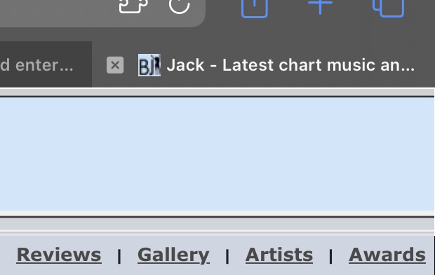
I personally feel like the "View new posts" link in the taskbar should be more prominent? As we are going blue with the new graphics, would it be possible to have a blue icon simply with the word "NEW that would help it to stand out a bit?
I know this is a terrible mock-up, but this is the sort of thing I mean, maybe positioned differently;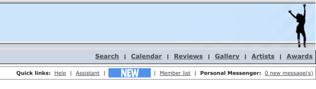
Posted by: Riser 22nd April 2024, 11:41 AM
I know this is a terrible mock-up, but this is the sort of thing I mean, maybe positioned differently;
Posted by: J00prstar 22nd April 2024, 12:40 PM
I would suggest putting it first in the order too if possible which also implies prominence instead of the implication that the first thing you'd need is help.
Posted by: -Jay- 22nd April 2024, 01:31 PM
Would it be possible to swap around the News from the Artist Forums and The Official Chart sections? Then the singles artwork images would be in the middle!
Posted by: awardinary 22nd April 2024, 01:36 PM
Im glad I wasnt the only one who thought this!
I feel I get tooo cheeky with all my requests so I try to keep quiet.
Posted by: JosephBoone 22nd April 2024, 03:29 PM
Made both of those changes! Would rather not make anything bold in the member bar as the inconsistency was annoying me before but "view new posts" being first should make it more prominent (and remember it's on the index panel now too!)
Posted by: -Jay- 22nd April 2024, 07:55 PM
Thank you Joseph!
Posted by: Linds. 22nd April 2024, 08:32 PM
Me lines!! They're gone!
Posted by: uhsting 22nd April 2024, 08:38 PM
+1 at bringing the underline for links back I think they make distinguishing links a lot easier. (Colours would be an alternative but I fear there may be too much clash with coloured roles x)
Posted by: JosephBoone 22nd April 2024, 08:40 PM
Am looking at colours atm so don't worry
Underlines are part of what makes the forum look dated - other forums with more contemporary layouts don't have underlined links (except on hover - which we have too atm). Give it a moment to adjust - I can bring the old style back easily but I think it's worth giving this a shot!
edit: seems not, links are back x
Posted by: -Jay- 22nd April 2024, 09:02 PM
For what it's worth, I liked it a lot without the lines! In fact, having under lines is quite an uncommon feature on a forum.
Look at...
Popjustice: https://forum.popjustice.com/
Atrl: https://atrl.net/forums/
UKMix: https://www.ukmix.org/
Haven: https://fatherandy2.proboards.com/
Nary a line to be seen x
Posted by: lotita 22nd April 2024, 09:03 PM
if we remove the lines would it give scope to remove some other clutter and then make the index font a bit bigger? Would be a dream for mobile!
Posted by: Chez Wombat 22nd April 2024, 09:10 PM
We need a greater contrast for the lack of underlines to stand out, those other forums have clearer contrast between link text and background colour, I just found it difficult to read (and yeah definitely need less of the text descriptions)
Posted by: uhsting 22nd April 2024, 09:17 PM
Blue seems to be a common colour for links but yes I think contrast should come first x
Posted by: JosephBoone 22nd April 2024, 09:20 PM
Was going to play with colours but didn't get the chance unfortunately.
Posted by: awardinary 22nd April 2024, 09:35 PM
As a famous Stereophonics song goes... Maybe Tomorrow...
Posted by: Linds. 22nd April 2024, 11:00 PM
I've just uncovered a pop justice account I made in 2015 that I've never used, I've replied to two topics and I'm very confused, I don't like that their links aren't underlined actually but it does look very slick and is mobile friendly. I can't bloody find anything on it though so I don't think I'll be making regular appearances
Posted by: J00prstar 23rd April 2024, 12:46 AM
I guess the thing with making links a colour is that on Buzzjack we also have text colours that a lot of forums don't have.
Posted by: Brer 23rd April 2024, 01:18 AM
#leaveourunderlinesalone
(in all seriousness, it could probably look ok if changed to have links contrast more with regular text in some other way, but I don't think the underlines are really a problem in the first place x)
Posted by: awardinary 23rd April 2024, 12:53 PM
One small additional feature request, in the new index panel, within The Official Chart section, please could there be a link to the actual chart for that week for quick access? Preferably, the weekly http://www.buzzjack.com/forums/index.php?showtopic=270783 thread.
Thank you Joseph!
Posted by: JosephBoone 23rd April 2024, 03:31 PM
Nice idea, have done that
Just gonna be fixing tiny things like that / any bugs over the next few days, nothing major's gonna change for the time being x
Posted by: JosephBoone 23rd April 2024, 05:32 PM
(experiencing some technical difficulties - not sure what's happened but am fixing it so please bear with while the post field looks ugly x)
edit: all is normal now, thanks for remaining calm x
Posted by: Long Dong Silver 23rd April 2024, 07:44 PM
But the quesrion on everynody's lips os if I'm gettin an illuminous member title for postage flops?!
Posted by: JosephBoone 23rd April 2024, 07:45 PM

Posted by: JosephBoone 28th April 2024, 11:17 AM
FYI - we're going to be trialling some visual changes today, particularly with the index page of the forum, to make it less cluttered. Please bear with us while we do this and don't panic yet, it's just a trial run and I've got the original format saved x
Posted by: Dexton 28th April 2024, 11:43 AM
When are we getting dark mode
Posted by: JosephBoone 28th April 2024, 11:44 AM
Way out of my capability unfortunately!!
Posted by: awardinary 28th April 2024, 11:46 AM
Tested some tags in the Dance forum for comparison.
Posted by: Dexton 28th April 2024, 11:52 AM
This new blue mode will settle for now x
Posted by: Jade 28th April 2024, 12:34 PM
Just noticed the lack of underline for the links in my signature and do think it looks more aesthetically pleasing
Posted by: Long Dong Silver 28th April 2024, 01:20 PM
I find this homepage format a little harder to read tbh
Posted by: JosephBoone 28th April 2024, 01:21 PM
What would make it easier for you Michael? All suggestions are welcome - like I say, it's a trial at the moment, so open to hearing what would benefit you guys.
Posted by: WhoOdyssey 28th April 2024, 01:28 PM
I agree, especially when comparing to how it was before: https://web.archive.org/web/20170308164342/http://www.buzzjack.com/forums/
I think the thread titles in the boxes need to be longer, currently they're dwarfed by sub-forum descriptions (if that makes sense haha).
This is probably just a personal thing, but I also find the blue text on the blue-ish background much harder to read in comparison to the previous black.
Posted by: Long Dong Silver 28th April 2024, 01:28 PM
I honestly think a daeker coloue would help, eithee in the text or on the backgeound. Maybe the rest will take awhile to get used to and I'm just missing the lines dividing the information?
Posted by: Y'all Starlight 28th April 2024, 01:32 PM
I think the thread titles in the boxes need to be longer, currently they're dwarfed by sub-forum descriptions (if that makes sense haha).
This is probably just a personal thing, but I also find the blue text on the blue background much harder to read in comparison to the previous black.
I would agree with all of this tbh, especially the blue text imo. Not any huge problems here, I just guess I'm just a person that doesn't like much change
Posted by: JosephBoone 28th April 2024, 01:35 PM
The thread titles box is basically the same size it always was! We're looking at shortening descriptions though - work in progress. Use UK Charts as an example of how we hope every description will look soon.
Happy to look at changing the blue text colour but not sure what would be better? Background is a very light grey, not blue! Perhaps a darker grey, but would it contrast enough with the non-link text?
Posted by: JosephBoone 28th April 2024, 01:47 PM
Changed the shade of blue to make it a bolder and darker colour, is this better at all? (have stolen the colour from another forum that has a very similar colour scheme to us! the only other difference, beyond a generally more modern layout, is bigger text sizes, which could also help if you guys think)
Posted by: Long Dong Silver 28th April 2024, 01:54 PM
Yeah that coloue is clearesr, Ns I think laeger text size would woek roo
Posted by: JosephBoone 28th April 2024, 02:11 PM
How does the bigger font on the index look?
Posted by: Mack. 28th April 2024, 02:16 PM
The shade of blue looks great.
Posted by: WhoOdyssey 28th April 2024, 02:35 PM
Yes, the bolder text is much better. My preference would probably still be black, but that's probably just a case of being so used to the old look.
Posted by: Long Dong Silver 28th April 2024, 02:55 PM
Ok the bigger ttext makes it easier!
Posted by: JosephBoone 28th April 2024, 03:17 PM
Many thanks for the feedback guys, really helpful!
Posted by: awardinary 28th April 2024, 03:54 PM
I think the statistical data for threads and replies could be in a smaller text, like a subheading, so it distinguishes from the main body text description for the forum.
Also slight OCD but the index columns arent the same width the further you scroll down the page.
Posted by: p a v 28th April 2024, 03:55 PM
we're not gray blobs anymore hurrah the new update looks v cunty
Posted by: JosephBoone 28th April 2024, 03:57 PM
Also slight OCD but the index columns aren’t the same width the further you scroll down the page.
Will have a look and see if I can make that work!
The index columns weren't the same size before, I think the topics/replies columns helped cover that up! This shouldn't be an issue once we have shorter descriptions for every forum though
Posted by: JSG 28th April 2024, 04:34 PM
My main issue with the site right now is the buzzjack header at the top of the screen. It looks so dated so if that could be changed, I think that would modernise the look of the forum quite a bit. The horrible colour, ancient font & text layout and that stupid dancing lady. It's all so very 90's even though the site was created in 2006.
Even Changing the color of the bluey/grey area around the text boxes would be an improvement. How would everyone feel about that?
Posted by: Brer 28th April 2024, 05:21 PM
Don't you dare touch Lady BuzzJack xx
Posted by: danG 28th April 2024, 05:21 PM
Lady Buzzjack is too big of an icon to ever get rid of!
Posted by: JosephBoone 28th April 2024, 05:23 PM
I think I maaaaay be able to change the logo, I agree it looks very dated. Even a little freshen up wouldn't hurt - perhaps incorporating Lady Buzzjack somehow x
or replacing her with the superior Lady Tina x
Posted by: uhsting 28th April 2024, 05:31 PM
Lady Buzzjack needs an svg update I fear (or in a much larger resolution in png)
Posted by: JSG 28th April 2024, 05:42 PM
Lady Tina is much more preferable for us classy gals x
Posted by: Jester 28th April 2024, 06:10 PM
Lady Buzzjack is iconic, but she could do with a makeover.
Posted by: JSG 28th April 2024, 06:19 PM
I would much prefer Buzzjack Music Entertainment Discussion would say Buzzjack Entertainment Forum, or even just Buzzjack. On the one line in bolder text. Maybe lady buzzjack would look better right next to the writing as well. Part of the issue is all the dead space between them aswell as the colour background.
Posted by: Tafty³³³ 28th April 2024, 08:08 PM
I’ve done a tag on a random thread in pop and it looks good! However, is there one for “Album”? I couldn’t see one?/was it agreed albums didn’t need one?
This is looking good though. Thanks Joseph!
Posted by: JosephBoone 28th April 2024, 08:10 PM
I haven't been able to change the size for that part separately to the description, but I've italicised it - does that work?
This is looking good though. Thanks Joseph!
You'll have to Ctrl+F5 this link below:
or clear your cache, or just wait, it should update in time! The smiley face should become the "Album" tag, it's just replaced one of my tests from earlier in the year ahaha. Thanks for the kind words!
Posted by: awardinary 28th April 2024, 08:14 PM
Possibly how about having it as a shade of grey perhaps so its less prominent than the rest of the text?
Posted by: awardinary 28th April 2024, 09:41 PM
Can I also suggest given the new colour scheme today for the speech bubble icons to be in this darker navy colour for new posts, much easier to spot on the index from the greyscale ones. Thanks Joseph!
Posted by: Long Dong Silver 28th April 2024, 10:30 PM
We need to do what the snake said snd have a giant, colourful buzzong bee flying into the corner, smiling!!
Posted by: TheSnake 28th April 2024, 10:34 PM
Indeed, a small bee to represent the buzz of Buzzjack. Still keep Lady Buzzjack though in some form as well. Could fit both of them in!
Posted by: WhoOdyssey 28th April 2024, 10:59 PM
Or Buster perhaps?
Posted by: Riser 28th April 2024, 11:08 PM
I'm no designer (and not sure if a logo change is even possible) but just putting the letters in BUZZJACK closer together would be such a good improvement. Could be as simple as this but could certainly be more extensive too.
Posted by: uhsting 28th April 2024, 11:54 PM
My instincts tell me the two main components that make the site look dated are that there is an overuse of borders around boxes and text so maybe remove some of them would give the site a more modern feel (and give the colours more prominence in separating different chunks on the forum); and that the site spans the entire length of the screen (I'm not sure how difficult it is to set it up especially for mobile users), so perhaps a fixed length (or flexible, like give the forum a max width) would help?
Potentially also the gradients used at parts of the forum as well
Posted by: JosephBoone 29th April 2024, 06:04 AM
I've actually mocked something up that's not dissimilar to this! I agree that simplicity could be the way to go. I'll work on it more later and maybe post to get some feedback
unless it looks horrible xPotentially also the gradients used at parts of the forum as well
The width of the forum is something I've absolutely considered already! Though I'd have to take some time to make sure I'm doing that properly so perhaps not an immediate solution. Thanks for mentioning though!
Posted by: JSG 29th April 2024, 06:15 AM
I 100% agree. Even moving the text to the left, slightly off center and incorporating lady buzzjack directly to the right of the text would be a nice way to honour her since everyone does want to keep her.
Posted by: Linds. 29th April 2024, 11:11 AM
Lady BuzzJack design contest!!!
Can she be ginger pls
Posted by: JosephBoone 29th April 2024, 04:49 PM
I've mocked this up... what do we think?
Was thinking we could keep the same current shade of blue for the background, so this is basically how it'll look:
Open to feedback! I think simplicity is key so I don't want to try anything too complex or artsy with it, but Lady Buzzjack wasn't easy to put in (and I was VERY careful making a cutout of her ) so if you guys think of a better placement for her then I'm all ears. Be gentle xx
Posted by: awardinary 29th April 2024, 05:02 PM
Going back to James' earlier remark about the subtitle description underneath, I think perhaps it could be reworded ever so slightly to be more in line with what the forum is about going forwards. Music is of course the primary subject but its so much more than just that! So perhaps some more creative juices will be needed to come up with a catchy slogan
Posted by: JosephBoone 29th April 2024, 05:07 PM
I've got no hope of coming up with a new slogan - open to ideas if anyone has any - but here's how it looks without any slogan:

(I don't really mind the current slogan though, music is what the majority of the forum is about though perhaps it should be "music AND entertainment discussion"?)
Posted by: JosephBoone 29th April 2024, 05:25 PM
One more example with a different subtitle (as I think it does look better with the text underneath)

Which covers pretty much all major sections of the forum. Charts are the very first section so feel notable enough to get a mention and it removes the slightly clunky wording
Posted by: Brer 29th April 2024, 05:39 PM
Looks good to me x
Posted by: uhsting 29th April 2024, 05:40 PM
oh yes this looks better!
What's the font you use btw?
Posted by: awardinary 29th April 2024, 05:41 PM
Oh that does look much better in the second one with the new description!
Joseph, you have outdone yourself yet again! 
Posted by: JosephBoone 29th April 2024, 05:44 PM
Thanks all!! By popular demand, Lady Tina may still be added to the right side of the logo xx
What's the font you use btw?
Helvetica Neue LT Std - was actually aiming for HeliosCond Bold which is the current logo's font but I obviously clicked the wrong thing
this one looks better though!!
Posted by: JSG 29th April 2024, 06:05 PM
The one with the white background looks amazing Joseph.
Posted by: Brer 29th April 2024, 06:12 PM
I demand this not to happen x
Posted by: JosephBoone 29th April 2024, 06:14 PM

Posted by: Linds. 29th April 2024, 06:20 PM
I like that Joseph! What if we swapped the darker blue and the pale blue around so the background is darker? Idk if that would just look awful though I feel like a darker background for the banner will section it off a little more from the rest of the site
Posted by: JosephBoone 29th April 2024, 06:23 PM
I just tried swapping and it didn't look good! the pale blue is too close to the white to work as a text outline unfortunately!
Posted by: awardinary 29th April 2024, 06:47 PM
Before we know it, Lady Jo, Lady Hannah and Lady Rachel will all be reunited on our logo!
Posted by: JosephBoone 29th April 2024, 06:50 PM
It's what we deserve x
Any more comments before I test the new logo at the top? x
Posted by: JosephBoone 29th April 2024, 07:02 PM
Trialling it at the top right now (I've got the old one saved don't worry) - not sure how I feel about the blue, I'll have a little rework to see if I can make it look more natural.
Posted by: awardinary 29th April 2024, 07:04 PM
Maybe a little gap needed between the lines and the frame border?
Posted by: TheSnake 29th April 2024, 07:05 PM
The small bee icon could go on the other side of the top banner representing the buzz of Buzzjack. A nice subtle bee in white silhouette form just like the new form of Lady Buzzjack.
Posted by: uhsting 29th April 2024, 07:07 PM
Remove the blue lines
Posted by: JosephBoone 29th April 2024, 07:24 PM
Oh I've just figured out how to do a gradient and I think that's made it all click!! What are we thinking?
Posted by: TheSnake 29th April 2024, 07:25 PM
It's also cool how the http://www.buzzjack.com homepage still has the old familiar logo and then when you click the links the new logo magically appears  , please keep this unique feature for a while - the transformation between old and new logos!
Posted by: JosephBoone 29th April 2024, 07:26 PM
, please keep this unique feature.The homepage code is separate, the new logo will appear there too when we're satisfied with how it looks

Posted by: TheSnake 29th April 2024, 07:33 PM
The small bee icon could go on the other side of the top banner representing the buzz of Buzzjack. A nice subtle bee in white silhouette form just like the new form of Lady Buzzjack.
Indeed it could Kath! I like how the top banner has changed to sky blue especially at the right end, it makes a potential small bee logo even more appropriate against the blue sky!
Posted by: JosephBoone 29th April 2024, 07:37 PM
Just had a try with this briefly...
Do we like? (obviously I'd look to change the other grey heading bar too)
Posted by: Long Dong Silver 29th April 2024, 07:41 PM
Omfg the nee Lady buzzjack/ banner looks SHAMAZING and so so so Chrisrmassy!!!!
However, it's missing something ... like a small white silhouette of a bee perhsps, mm maybe lile this? :
The small bee icon could go on the other side of the top banner representing the buzz of Buzzjack. A nice subtle bee in white silhouette form just like the new form of Lady Buzzjack.
This post has been edited by TheSnake: 2 minutes ago
Posted by: Long Dong Silver 29th April 2024, 07:41 PM
Omfg that is so true!!
Posted by: Cowboy Cody 29th April 2024, 07:43 PM
The fade to sky blue looks amazing!
Posted by: Long Dong Silver 29th April 2024, 07:44 PM
The bee on the right side would woek so well!!
Posted by: Linds. 29th April 2024, 07:46 PM
oooh liking it!
Posted by: TheSnake 29th April 2024, 07:54 PM
(obviously I'd look to change the other grey heading bar too)I'm Good (Blue)
Posted by: WhoOdyssey 29th April 2024, 07:54 PM
It makes the site look more dated imo, but that's not a bad thing.
Posted by: Rough_edges 29th April 2024, 08:03 PM
Liked all the changes so far but that blue is absolutely horrendous in my opinion very medical and dated. Not as easy to read anything on home page even with the latest post. And the 'Single' 'Artist' which is in use in dance forum incredibly jarring
Posted by: Long Dong Silver 29th April 2024, 08:06 PM
I don't know what it is for mw eithee, but somerhing does look dated atm with the changes. Not sure what it is? Banner is srill excellent though
Posted by: JosephBoone 29th April 2024, 08:09 PM
Happy to work on different, perhaps less vibrant gradient colours for the rest of the index at some point - remember it's just a trial.
Haven't really mentioned the genre forum tags yet (will get round to it) but they're the best thing we have to an actual tagging system and worth giving a shot - it's part of a potential wider plan so hopefully you'll get used to them when they're being used widely across all four genre forums.
The software the forum's using?
It's always going to look dated and I think that's something to remember - I can only do so much to modernise the forum when we're using software that hasn't been updated in a LONG time.
Posted by: Rough_edges 29th April 2024, 08:11 PM
Joseph its the text when you ate on the main index for example latest post in pop forum is difficult to read in the colour and size without zooming in! Great work anyway!
Posted by: awardinary 29th April 2024, 08:17 PM
Do we like?
(obviously I'd look to change the other grey heading bar too)Looks promising, might brighten up the aesthetics for the summertime.
I almost feel we could have a colour scheme per season of the year, so warmer hues of brown and red for Autumn for example, and greens and yellow for Spring.
Posted by: awardinary 29th April 2024, 08:29 PM
, please keep this unique feature for a while - the transformation between old and new logos!One bug bearer about that page is the URL description of that page always just says "Jack" whenever it is open;
Posted by: uhsting 29th April 2024, 08:50 PM
omg I feel called out
anyways like that the top looks cleaner now. I think the bar should take to one colour rather than gradient which would look a bit more pleasing to the eye
Posted by: JosephBoone 29th April 2024, 08:53 PM
Wardy - the page title is "Buzz Jack" with a space there for some reason, it does have the Buzz part so not sure why it just says Jack for you!
anyways like that the top looks cleaner now. I think the bar should take to one colour rather than gradient which would look a bit more pleasing to the eye
As in the subheading titles like in the screenshot? Happy to explore that! (not tonight as I'll fall down a rabbit hole and wonder why I'm tired tomorrow x)
Posted by: awardinary 29th April 2024, 08:56 PM
BuzzJack merchandise when?
Posted by: uhsting 29th April 2024, 08:57 PM
As in the subheading titles like in the screenshot? Happy to explore that! (not tonight as I'll fall down a rabbit hole and wonder why I'm tired tomorrow x)
Oh I mean the heading x
Posted by: JosephBoone 29th April 2024, 08:57 PM
Oh okay - I actually thought the single colour looked considerably worse...!
Posted by: dandy* 29th April 2024, 09:10 PM
What does it look like if it fades towards the colour blue you have on the borders of the letters in the logo?
I didnt see it in place when it was one colour but I suspect I may prefer without gradient
Posted by: -Jay- 29th April 2024, 09:14 PM
I like the gradient! I wondered about a different (than the banner) colour scheme for the gradient of the headings. Still within the blue spectrum, but maybe a grey-ish blue similar to how it is already. In my mind that could look quite fresh but who knows if it would in reality.
I love the banner by the way, that goes a very long way in freshening up. Sacrilege, but I've never really liked Lady BuzzJack - not iconic to me x - but how she's incorporated now does look soooo much better than the original black silhouette that was hanging out all alone on the right of the page lel
P.S. Lady Tina >>>>>>>>>

Posted by: JosephBoone 29th April 2024, 09:15 PM
Will give that a try tomorrow! (@ both Jay and Dandy - happy to play with the gradient colours)
Posted by: dandy* 29th April 2024, 09:20 PM
I think Jay and I are on similar lines tbh
even on lady Buzzjack whom I could take or leave.
Definitely not on the similar lines with lady Tina though!!
Posted by: JosephBoone 29th April 2024, 09:21 PM
(I could also take or leave Lady Buzzjack  )
)
Posted by: Linds. 29th April 2024, 09:26 PM
Lady BuzzJack is just misunderstood 
We don't have enough ladies here as it is x
Posted by: -Jay- 29th April 2024, 09:33 PM
Definitely not on the similar lines with lady Tina though!!
!! #bringbackladytina or as a compromise, introduce Lady Rachel 
Posted by: lewistgreen 29th April 2024, 09:44 PM
I would buy this
Posted by: TheSnake 29th April 2024, 09:54 PM
Aah ahh we fade to grey, the blue was a bit much for the category headings!
Posted by: Brer 29th April 2024, 09:55 PM
The level of disrespect to r Lady BuzzJack is frankly offensive x
Posted by: JosephBoone 30th April 2024, 05:58 AM
Had a play around with the blue gradient, is this better? (might need a hard refresh to show if it's not automatically)
Posted by: awardinary 30th April 2024, 06:08 AM
Morning Joseph! 
Dont work too hard today, we dont want our expert designer having burnout!!
Just a really quick thing, the links at the top are too bunched up on one screen, see screenshots below for comparison;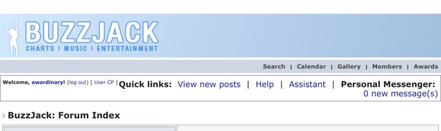
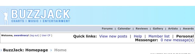
Could we have like the second image shows with the Personal Messenger on the bottom line?
Thank you!
Posted by: JosephBoone 30th April 2024, 06:11 AM
I'm off to work momentarily so you're safe from any tweaks for a few hours!
The right hand member bar used to display that way on my phone but it stopped when I added some code to stop it resizing, is it still displaying that way on your phone? Not totally sure how to stop it if it is
Posted by: awardinary 30th April 2024, 06:25 AM
Might just be on mobile, seems fine on tablet/desktop.
Posted by: k👠th 30th April 2024, 06:40 AM
The small bee icon could go on the other side of the top banner representing the buzz of Buzzjack. A nice subtle bee in white silhouette form just like the new form of Lady Buzzjack.
This post has been edited by TheSnake: 2 minutes ago
Omfg this. A small bee to represent a buzz of Buzzjack
Posted by: Linds. 30th April 2024, 07:45 AM
I actually liked the brighter blue better, the links are okay for me and I'm on my phone
Posted by: JosephBoone 30th April 2024, 07:58 AM
I've got the bright blue version saved so if you guys prefer it I can change it back! I'll take a consensus as I like both and don't mind x
Posted by: Ansel 30th April 2024, 08:17 AM
I think both look great and a lot fresher than before! I do like the brighter blue, but I think the newest version fits better with the shades of blue used across the rest of the site and feels a bit more professional because of that.
Posted by: JSG 30th April 2024, 08:40 AM
I'm in agreement with Ansel here. The newer shades and gradient look much better than the brighter blue because I think the brighter blue contrasted too much with the brightness of the site and the grey bars beneath each forum part. The new one fits in much more seemlessly.
Posted by: k👠th 30th April 2024, 08:50 AM
Argeed.
Posted by: All★bySmashMouth 30th April 2024, 09:53 AM
I personally prefer the darker blue gradient for the same reasons mentioned.
Also, I think the Compilation image could be narrowed a bit (e.g check the Pop forum), the thread titles are a little too closer to the middle.
Posted by: JosephBoone 30th April 2024, 09:58 AM
I think it'll look better when all of the surrounding threads have a tag too! Jt is quite long though so I take your point, not sure what it could be shortened to and still remain clear
Posted by: -Jay- 30th April 2024, 11:04 AM
Is it possible to make the word images equal in width? Maybe Compilation reduced slightly and Album/Single etc lengthened? Perhaps the width being uniform would look pleasing, even if the font sizes are different?
Posted by: danG 30th April 2024, 11:47 AM
Comp. for compilation perhaps 🤔
Posted by: awardinary 30th April 2024, 12:26 PM
Also, when you think about it, other than the popular Now thread that gets bumped weekly, what other threads do we have, or are we likely to have in the future, that would require the compilation tag?
I think its unnecessary personally, but thats my viewpoint.
Also going to bump this request I made in another thread due to OCD ;
That means tweaking the forums favourite song contest forum too.
Posted by: JosephBoone 30th April 2024, 12:31 PM
Happy to remove compilation if we feel it's not necessary! The "Other" tag can cover the tiny number we have I suppose.
Also happy to edit Buzzjack to BuzzJack when I get in x
Posted by: Linds. 30th April 2024, 12:37 PM
Gonna make as many compilation threads as possible now, who fancies an in depth analysis on 'My Songs' 2008 or perhaps the iconic 'Pop Party 3' of 2005? x
Posted by: awardinary 30th April 2024, 12:37 PM
I suppose Compilation tag could work for BuzzJack Presents too if Colm and Rich were happy to do that, but generally I cant see it being used often for threads.
Also, as a side note, does everything in the genre forums presently need to be tagged "Other" if it doesnt fit into any other category of genre tag? I would rather still have use of the generic tags for things like survivors, polls, quizzes etc
unless
someday down the line these types of threads get their own custom tags too maybe. But that seems a little much maybe.
Simplicity for the win!
Posted by: JosephBoone 30th April 2024, 12:37 PM
!!!!!! Pop Princesses rate x
Posted by: Linds. 30th April 2024, 12:53 PM
Peak queer culture
Posted by: TheSnake 30th April 2024, 02:03 PM
This might be merely blue sky thinking but I preferred the blue sky banner.
Posted by: JosephBoone 30th April 2024, 03:22 PM
Also, as a side note, does everything in the genre forums presently need to be tagged "Other" if it doesnt fit into any other category of genre tag? I would rather still have use of the generic tags for things like survivors, polls, quizzes etc unless someday down the line these types of threads get their own custom tags too maybe. But that seems a little much maybe.
Simplicity for the win!
I'll remove compilation then!
I'd say everything in the genre forums should have a tag of some sort to make the system really work, but we could potentially have "Contest" for UP/Club Bizarre/etc and "Game" tags for survivors and rates?
Posted by: vibe 30th April 2024, 04:14 PM
I much prefer when artists was at the top rather than the bottom.
Posted by: JosephBoone 30th April 2024, 04:22 PM
Not sure what you mean!
Posted by: HausofKubrick 30th April 2024, 04:56 PM
The AF forums used to be below Genre forums didn't they? But they got demoted down the index page
Also, I MUCH prefer the darker blue on the heading, looks a lot more classy imo~
Posted by: dandy* 30th April 2024, 05:02 PM
Another vote for the darker blue here
Posted by: awardinary 30th April 2024, 05:04 PM
Also, I MUCH prefer the darker blue on the heading, looks a lot more classy imo~
Maybe a link could be placed in the third column of the index panel at the top to this page for easy reference for ones wanting a quick link?
http://www.buzzjack.com/forums/View-All-Artists-f13.html
Posted by: JosephBoone 30th April 2024, 05:06 PM
I think the AFs have been low down as long as I've been here, it'd be easy enough to move them up (and quite honestly, it'd make sense - the music sections are all at the top before the non-music sections, then it goes back to music)
Posted by: vibe 30th April 2024, 05:10 PM
No artist tab at top of page.
Posted by: -Jay- 30th April 2024, 05:10 PM
Team Darker Blue
Team Move The AFs Up
Posted by: k👠th 30th April 2024, 05:12 PM
I'm not a fan of the categories but loving all the other changes x
The categories feel like they're cluttering the page
Posted by: JosephBoone 30th April 2024, 05:17 PM
Darker blue is here to stay then!
Honestly I didn't realise anyone ever used it! It's still there on the homepage or by clicking http://www.buzzjack.com/artists/ but it's sooooo ugly that I want to draw as little attention to it as possible
(see also: Reviews, and other than the homepage, they're the only two pages linked at the top of the forum that don't directly connect to the Admin CP so are less easy to try and tidy)Would love to move the AFs a bit further up the forum though, I've always believed they're far too buried where they are - they'd make more sense below genres quite honestly!
Posted by: dandy* 30th April 2024, 05:46 PM
The categories feel like they're cluttering the page
They're the bit that it is taking me longest to adjust to as well. I'm going to give it time because I got used to the new member/moderator/etc bits in the post profiles
Posted by: Long Dong Silver 30th April 2024, 05:48 PM
Oh, won't somebody design a cartoon bee silhouette flying into the corner?!
Posted by: WhoOdyssey 30th April 2024, 05:54 PM
The categories feel like they're cluttering the page
I agree with that
Posted by: awardinary 30th April 2024, 05:58 PM
So suggest something more helpful then?
Posted by: JosephBoone 30th April 2024, 06:06 PM
Yup I think we just need time to adjust, I appreciate the open-minded approach here (and it's part of a wider genre forum initiative which is still being finalised, which is why we've not really mentioned the tags yet, but please embrace them because otherwise nobody will ever get used to them!)
Posted by: Jester 30th April 2024, 06:31 PM
The dark blue is fabulous for the banner!
Posted by: Calum 30th April 2024, 06:43 PM
Just an observation, but as a genre mod did you not have ample opportunity before these changes happened to raise concerns with Joseph/mgmt? I remember around the time of the survey the genre forums tags, etc were all mentioned?
Posted by: WhoOdyssey 30th April 2024, 06:47 PM
I think they're a good idea, but having actually seen them in place for a few days, they do seem to make the pages feel a little cluttered.
Posted by: All★bySmashMouth 30th April 2024, 06:47 PM
The Compilation tag sure was important to discuss. It was a thought I had after seeing it being applied.
As for tags being a bit of a clutter, I imagine it's because they stand out a lot not only for being new additions but (maybe) for the font used or size/width.
Posted by: awardinary 30th April 2024, 07:18 PM
(see also: Reviews, and other than the homepage, they're the only two pages linked at the top of the forum that don't directly connect to the Admin CP so are less easy to try and tidy)Would love to move the AFs a bit further up the forum though, I've always believed they're far too buried where they are - they'd make more sense below genres quite honestly!
Didn't even notice the Reviews were gone! Is the Gallery still necessary in 2024?
Don't use it myself.Does anyone still get google ads at the top of their index? I used to years ago before enabling content blockers, but I just wonder if that gaping space to the right of "Latest Site News" could be better used if it is available?
Posted by: JosephBoone 30th April 2024, 07:20 PM
Don't use it myself.Does anyone still get google ads at the top of their index? I used to years ago before enabling content blockers, but I just wonder if that gaping space to the right of "Latest Site News" could be better used if it is available?
The gallery's a pretty cool feature for the AFs if nothing else! I'd love to clear it out though - another urge from me to everyone to CHECK YOUR GALLERY PICS AND CLEAR OUT ANY RUBBISH! Especially any old photos of yourself that you'd forgotten you'd posted online.
We've not had Google ads for a little while now unfortunately. I'd love to utilise that space somehow but I don't want to remove it for Phil to return and hope to reinstate the ads...! Might look at something at some point x
(Reviews is also still viewable through the homepage but it's such an ugly feature and not remotely utilised so I'm quite happy tucking it away
)
Posted by: TheSnake 30th April 2024, 07:36 PM
Yeah that right corner is so empty. I could try and make one to send to Joseph, maybe it could have some faded yellow and black bee colours like looking through frosted glass. The colour of the top banner looks like frosted glass anyway.
Posted by: Long Dong Silver 30th April 2024, 10:11 PM
Omfg you have to do it!!
Posted by: Hassaan 1st May 2024, 09:36 PM
Is there a possibility of a mobile skin?
I don't browse the forum on mobile that often but I think it'd make it slightly easier.
Posted by: JosephBoone 1st May 2024, 09:49 PM
Would love one but probably out of my capabilities!
Posted by: awardinary 1st May 2024, 10:19 PM
I think a greyer tone for the statistical data would look better than italicised perhaps, could this be tried to see if it looks better maybe?
I think this is needed also, but again if others dont then thats fine.
Lastly (for now
)
Dont work too hard today, we dont want our expert designer having burnout!!
Just a really quick thing, the links at the top are too bunched up on one screen, see screenshots below for comparison;
Could we have like the second image shows with the Personal Messenger on the bottom line?
Thank you!
Just bringing this back as it seems the links on the right on a mobile remain larger than the ones on the left of the same bar and I want to know if anyone else gets this on a mobile device too? Im an iPhone user, but on my iPad all the links look fine and are the same size as seen in this screenshot
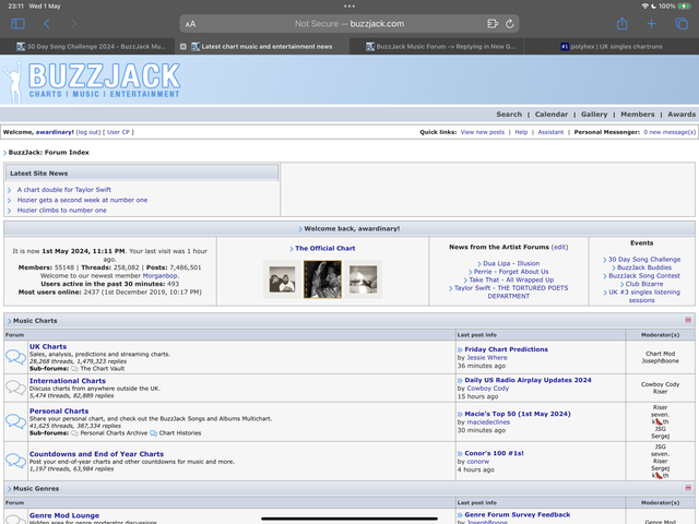
Not sure if theres anything that you can do there Joseph but it seems strange to be one size on mobile and another on tablet/desktop
Anyway, thats enough of a headache to give you for the rest of the week so Ill shut up now!
Posted by: TheSnake 1st May 2024, 10:34 PM
Yeah I would love it too Joseph, would really put the buzz into BuzzJack, but I don't know whether I could create a high quality image of a bumblebee that could go with the current top banner colour/graphics scheme. Maybe I will ask someone who is more expeienced with graphics. Leave it with me for a while.
Posted by: Linds. 1st May 2024, 10:49 PM
I think it's just your phone Wardy, mine is fine 
Posted by: JosephBoone 2nd May 2024, 06:01 AM
It used to display big on my phone when I first made the changes to it but I added a little fix in the code and it's been fine since, so I'd recommend clearing your browser cache, Wardy. Other than that there's nothing I can do, the fix I implemented was the only one I could find.
I'd rather not change the blue of the speech bubbles to maych the links, when the blue of the speech bubbles is also the blue of the "edit", "quote" buttons etc, and the blue that borders the logo! It doesn't all need to be the same shade of blue, some variance is quite nice I think.
May be able to try the colour change for the thread and reply counts, though the colour of this text (like the size) is specified in the stylesheet for that entire section so I'm not convinced it'll work either I'm afraid.
Posted by: Flatcap 2nd May 2024, 06:16 AM
These changes are looking great. Are you going to work for a rest now?
Posted by: JSG 2nd May 2024, 06:33 AM
I agree. Buzzjack looks in great shape Joseph! Time to take a break!
Posted by: HausofKubrick 2nd May 2024, 06:34 AM
Seph to take a break and experienced graphic designer TheSnake to take over proceedings now?
Posted by: awardinary 2nd May 2024, 06:37 AM
Oh and I can confirm that the 30 Day Song Challenge is over now so that shortcut on the index panel can go now. Thank you Joseph for promoting it in April.
Posted by: Long Dong Silver 2nd May 2024, 01:19 PM
THIS!!!
Posted by: JosephBoone 2nd May 2024, 03:29 PM
Thanks for the kind words guys! I think we're pretty much done - last thing for now is moving the AFs up as suggested earlier in the thread. It's easy to move back if people REALLY hate it, but it makes much more sense for the flow of the forum to be charts -> music discussion -> entertainment (and general) as per the new tagline!
(not to say I won't spot the occasional thing from here on in that I won't want to change but I think that's all the big stuff done for now x)
Posted by: *Tim 2nd May 2024, 04:17 PM
Since the changes I can no longer open BJ on desktop? Has anyone else had this problem?
Posted by: JosephBoone 2nd May 2024, 04:24 PM
Which browser are you on? It's fine for me on Chrome and Edge on my desktop (which is where I've been making the changes)
Posted by: *Tim 2nd May 2024, 08:25 PM
I'm on Chrome, it works fine on my phone on chrome as well so it's weird.
It gives me a non-supported protocol? ERR_SSL_VERSION_OR_CIPHER_MISMATCH
I'll see if I can google for a solution tomorrow, maybe it's on my end then if I'm the only one
Posted by: JosephBoone 2nd May 2024, 08:28 PM
It gives me a non-supported protocol? ERR_SSL_VERSION_OR_CIPHER_MISMATCH
I'll see if I can google for a solution tomorrow, maybe it's on my end then if I'm the only one
Are you using a URL with "https" in it? Irritatingly Buzzjack doesn't have the "secure" SSL padlock (I'm not sure this is something I can sort, I don't really know anything about how you'd obtain one so I may have to research!), so it needs to just be "http" at the beginning of the URL. I just attempted accessing Buzzjack with "https" and I got the same error as you so it could be that somehow?
Posted by: Long Dong Silver 2nd May 2024, 09:31 PM
Ma custom username, slippin away
Posted by: TheSnake 3rd May 2024, 11:19 PM
Don't know what you mean but I keep thinking the Buzzjack user 'My...WAP?' is you.
Posted by: Long Dong Silver 3rd May 2024, 11:50 PM
I want a coloeful udem
Vttle in snazzy azzy ver bright coloues
Posted by: JSG 14th May 2024, 11:06 AM
Aside from looking much cleaner and modern, I must say my favourite QOL improvement is the addition of a tick in the folder next to a thread you've commented on. Now if I'm not mistaken there was no way to know aside from Memory or popping into a thread to see what you'd commented on but I really do like this so much.
Posted by: awardinary 14th May 2024, 11:15 AM
I can see how that would be useful especially when commenting on personal charts.
Before, the only way I knew how to "tag" if I had been in a thread or not was to give the thread a star rating which showed up in the index. The only problem is that some people used the same thread each week to post chart updates so there was no way to know if I had missed that thread. I guess by the same logic that problem still exists.
Posted by: dandy* 14th May 2024, 07:43 PM
If I remember correctly, I think the colour of the folder or something showed whether you had commented or not - there definitely was something but it clearly wasn't very clear as I already can't remember for certain what it was!
Agreed the new approach is much better
Posted by: JosephBoone 14th May 2024, 07:45 PM
There was a little L shape in the bottom right corner of the old folder icons! It's not a new feature, just perhaps a little more obvious now
Posted by: dandy* 14th May 2024, 08:47 PM
That was it! I knew there was something... sadly the only thing I could remember properly was it took me YEARS on here before I realised what it was
Posted by: Cameron 24th May 2024, 04:59 PM
Logged in for the first time since November and nearly passed out. Love it!!!
Can I get a personalised role like Jade please. The forums pop idol xoxo 
Posted by: TheSnake 25th May 2024, 08:11 PM
Artist Forums bit of homepage not big enough I think - easily missed
Also Eurovision description should maybe be changed to 'All the news, gossip, reviews and reactions as we prepare for Suisse 2025'.
Posted by: JosephBoone 25th May 2024, 08:13 PM
Do you have any AFs activated? I have them all switched on so it's a pretty big section for me.
Will update the Eurovision description as advised by the mods of that section!
And thanks Cameron!
Posted by: TheSnake 25th May 2024, 08:16 PM
Didnt know about that Artist Forum feature, it looks very narrow on the homepage without it for new members though!
Posted by: JosephBoone 25th May 2024, 08:20 PM
Nothing's changed about how that section would look! It's just higher up the page than it used to be.
Powered by Invision Power Board
© Invision Power Services