  |
| Track this thread | Email this thread | Print this thread | Download this thread | Subscribe to this forum |
 Tuesday, 07:18 PM Tuesday, 07:18 PM
Post
#301
|
|
 Here to play, here to stay
Pronouns: he/him
Joined: 8 February 2015 Posts: 20,384 User: 21,587 
           |
QUOTE(JosephBoone @ 30th April 2024, 06:17 PM)  Honestly I didn't realise anyone ever used it! It's still there on the homepage or by clicking this link but it's sooooo ugly that I want to draw as little attention to it as possible  (see also: Reviews, and other than the homepage, they're the only two pages linked at the top of the forum that don't directly connect to the Admin CP so are less easy to try and tidy) (see also: Reviews, and other than the homepage, they're the only two pages linked at the top of the forum that don't directly connect to the Admin CP so are less easy to try and tidy)Would love to move the AFs a bit further up the forum though, I've always believed they're far too buried where they are - they'd make more sense below genres quite honestly! Didn't even notice the Reviews were gone! Is the Gallery still necessary in 2024?  Don't use it myself. Don't use it myself.Does anyone still get google ads at the top of their index? I used to years ago before enabling content blockers, but I just wonder if that gaping space to the right of "Latest Site News" could be better used if it is available? 
|
 |
 
|
|
Tuesday, 07:20 PM
Post
#302
|
|
 you never forget your first time...
Pronouns: he/him
Joined: 19 April 2011 Posts: 121,981 User: 13,530 
          |
QUOTE(awardinary @ 30th April 2024, 08:18 PM) Didn't even notice the Reviews were gone! Is the Gallery still necessary in 2024? Don't use it myself.Does anyone still get google ads at the top of their index? I used to years ago before enabling content blockers, but I just wonder if that gaping space to the right of "Latest Site News" could be better used if it is available? The gallery's a pretty cool feature for the AFs if nothing else! I'd love to clear it out though - another urge from me to everyone to CHECK YOUR GALLERY PICS AND CLEAR OUT ANY RUBBISH! Especially any old photos of yourself that you'd forgotten you'd posted online. We've not had Google ads for a little while now unfortunately. I'd love to utilise that space somehow but I don't want to remove it for Phil to return and hope to reinstate the ads...! Might look at something at some point x (Reviews is also still viewable through the homepage but it's such an ugly feature and not remotely utilised so I'm quite happy tucking it away  ) )
|
|
|
|
|
Tuesday, 07:36 PM
Post
#303
|
|
 Say that hiss with your chest, and...
Joined: 24 May 2016
Posts: 18,494 User: 23,308
   |
QUOTE(Long Dong Silver @ 30th April 2024, 06:48 PM) Oh, won't somebody design a cartoon bee silhouette flying into the corner?! Yeah that right corner is so empty. I could try and make one to send to Joseph, maybe it could have some faded yellow and black bee colours like looking through frosted glass. The colour of the top banner looks like frosted glass anyway. This post has been edited by TheSnake: Tuesday, 07:41 PM |
|
|
|
|
Tuesday, 10:11 PM
Post
#304
|
|
|
Buffy/Charmed
Joined: 18 April 2013
Posts: 44,166 User: 18,639
      |
QUOTE(TheSnake @ 30th April 2024, 08:36 PM) Yeah that right corner is so empty. I could try and make one to send to Joseph, maybe it could have some faded yellow and black bee colours like looking through frosted glass. The colour of the top banner looks like frosted glass anyway. Omfg you have to do it!! |
|
|
|
|
16 hours ago
Post
#305
|
|
|
BuzzJack Enthusiast
Joined: 17 July 2015
Posts: 596 User: 22,168
|
Is there a possibility of a mobile skin?
I don't browse the forum on mobile that often but I think it'd make it slightly easier. |
|
|
|
|
16 hours ago
Post
#306
|
|
|
you never forget your first time...
Pronouns: he/him
Joined: 19 April 2011 Posts: 121,981 User: 13,530
|
Would love one but probably out of my capabilities!

|
|
|
|
|
16 hours ago
Post
#307
|
|
|
Here to play, here to stay
Pronouns: he/him
Joined: 8 February 2015 Posts: 20,384 User: 21,587
|
QUOTE(awardinary @ 28th April 2024, 04:54 PM) I think the statistical data for threads and replies could be in a smaller text, like a subheading, so it distinguishes from the main body text description for the forum. QUOTE(JosephBoone @ 28th April 2024, 09:10 PM) I haven't been able to change the size for that part separately to the description, but I've italicised it - does that work? QUOTE(awardinary @ 28th April 2024, 09:14 PM) Possibly
how about having it as a shade of grey perhaps so its less prominent than the rest of the text? I think a greyer tone for the statistical data would look better than italicised perhaps, could this be tried to see if it looks better maybe? QUOTE(awardinary @ 28th April 2024, 10:41 PM) Can I also suggest given the new colour scheme today for the speech bubble icons to be in this darker navy colour for new posts, much easier to spot on the index from the greyscale ones. I think this is needed also, but again if others dont then thats fine.  Lastly (for now  ) )
QUOTE(awardinary @ 30th April 2024, 07:08 AM) Morning Joseph!  Dont work too hard today, we dont want our expert designer having burnout!! Just a really quick thing, the links at the top are too bunched up on one screen, see screenshots below for comparison;   Could we have like the second image shows with the Personal Messenger on the bottom line? Thank you!  Just bringing this back as it seems the links on the right on a mobile remain larger than the ones on the left of the same bar and I want to know if anyone else gets this on a mobile device too? Im an iPhone user, but on my iPad all the links look fine and are the same size as seen in this screenshot 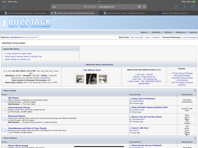 Not sure if theres anything that you can do there Joseph but it seems strange to be one size on mobile and another on tablet/desktop Anyway, thats enough of a headache to give you for the rest of the week so Ill shut up now! 
|
|
|
|
|
15 hours ago
Post
#308
|
|
|
Say that hiss with your chest, and...
Joined: 24 May 2016
Posts: 18,494 User: 23,308
|
QUOTE(Long Dong Silver @ 30th April 2024, 11:11 PM) Omfg you have to do it!! QUOTE(JosephBoone @ 1st May 2024, 10:49 PM) Would love one but probably out of my capabilities! Yeah I would love it too Joseph, would really put the buzz into BuzzJack, but I don't know whether I could create a high quality image of a bumblebee that could go with the current top banner colour/graphics scheme. Maybe I will ask someone who is more expeienced with graphics. Leave it with me for a while. This post has been edited by TheSnake: 15 hours ago |
|
|
|
|
15 hours ago
Post
#309
|
|
 laugh 'til we cry
Pronouns: she/her
Joined: 29 August 2014 Posts: 13,766 User: 21,176 
    |
I think it's just your phone Wardy, mine is fine

|
|
|
|
|
8 hours ago
Post
#310
|
|
|
you never forget your first time...
Pronouns: he/him
Joined: 19 April 2011 Posts: 121,981 User: 13,530
|
It used to display big on my phone when I first made the changes to it but I added a little fix in the code and it's been fine since, so I'd recommend clearing your browser cache, Wardy. Other than that there's nothing I can do, the fix I implemented was the only one I could find.
I'd rather not change the blue of the speech bubbles to maych the links, when the blue of the speech bubbles is also the blue of the "edit", "quote" buttons etc, and the blue that borders the logo! It doesn't all need to be the same shade of blue, some variance is quite nice I think. May be able to try the colour change for the thread and reply counts, though the colour of this text (like the size) is specified in the stylesheet for that entire section so I'm not convinced it'll work either I'm afraid. |
|
|
|
|
8 hours ago
Post
#311
|
|
|
Nah.
Joined: 7 March 2006
Posts: 15,573 User: 27
  |
These changes are looking great. Are you going to work for a rest now?
|
|
|
|
|
7 hours ago
Post
#312
|
|
|
BuzzJack Legend
Pronouns: He/Him
Joined: 18 March 2013 Posts: 34,877 User: 18,473
 |
QUOTE(Flatcap @ 2nd May 2024, 07:16 AM) These changes are looking great. Are you going to work for a rest now? I agree. Buzzjack looks in great shape Joseph! Time to take a break!
|
|
|
|
|
7 hours ago
Post
#313
|
|
 ⬛
Joined: 17 February 2011
Posts: 56,237 User: 13,007
            |
Seph to take a break and experienced graphic designer TheSnake to take over proceedings now?

|
|
|
|
|
7 hours ago
Post
#314
|
|
|
Here to play, here to stay
Pronouns: he/him
Joined: 8 February 2015 Posts: 20,384 User: 21,587
|
Oh and I can confirm that the 30 Day Song Challenge is over now so that shortcut on the index panel can go now. Thank you Joseph for promoting it in April.
|
|
|
|
|
1 hour ago
Post
#315
|
|
|
Buffy/Charmed
Joined: 18 April 2013
Posts: 44,166 User: 18,639
|
QUOTE(HausofKubrick @ 2nd May 2024, 07:34 AM) Seph to take a break and experienced graphic designer TheSnake to take over proceedings now? THIS!!!
|
|
|
|
|
| Time is now: 2nd May 2024, 02:23 PM |
Copyright © 2006 - 2024 BuzzJack.com
About | Contact | Advertise | Privacy Policy | Terms of Service


