  |
| Track this thread - Email this thread - Print this thread - Download this thread - Subscribe to this forum |
 30th June 2016, 09:10 PM 30th June 2016, 09:10 PM
Post
#21
|
|
 BuzzJack Idol
Joined: 8 December 2010
Posts: 50,982 User: 12,472 
     |
Yeah, I'm pretty impartial to it. I suppose the styling makes it look important, like something you need to unfasten to open but, for a collection of the biggest and best pop songs in the world, it's a pretty nothingy cover.
|
 |
 
|
|
1st July 2016, 10:56 AM
Post
#22
|
|
 BuzzJack Platinum Member
Joined: 31 August 2010
Posts: 8,797 User: 11,763
|
Madonna wanted a black and white photo by herb ritts (i think) where she is grabbing her crotch to be the cover. Her record company wouldn't agree , i think that pic ended up in the booklet.
|
|
|
|
|
1st July 2016, 11:12 AM
Post
#23
|
|
|
BuzzJack Idol
Joined: 8 December 2010
Posts: 50,982 User: 12,472
|
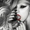
^ This one?
 I'd personally have liked these images used for the front and back covers respectively:  
|
|
|
|
|
1st July 2016, 11:14 AM
Post
#24
|
|
 Mansonette
Joined: 7 March 2006
Posts: 35,311 User: 54
               |
I would have liked a close up of her face with her hands framing it like they do in the dance to Vogue, that would have been iconic.
|
|
|
|
|
1st July 2016, 12:31 PM
Post
#25
|
|
|
BuzzJack Platinum Member
Joined: 31 August 2010
Posts: 8,797 User: 11,763
|
That's the one Liam

|
|
|
|
|
1st July 2016, 06:36 PM
Post
#26
|
|
|
⬛
Joined: 17 February 2011
Posts: 56,215 User: 13,007
             |
 18. Like A Prayer // 13 voters / 63 points And next up we lose the other album to not feature Madonna's face. One of her biggest musical projects and most iconic albums, it does come with a frankly odd choice of cover. For the album's photoshoot Madonna went blonde but the actual album artwork features only a close up of her midriff with slightly opened jeans. It's apparently a reference to 'Sticky Fingers' by The Rolling Stones but for me it can never reflect the hugeness of the album and what it stands for. Very similar scores to The Immaculate Collection ;o Lovers: Liamk 8, Harry, Jay, Leww 7 Haters: Regina, Haus, Josh 2, |
|
|
|
|
1st July 2016, 09:45 PM
Post
#27
|
|
|
BuzzJack Idol
Joined: 8 December 2010
Posts: 50,982 User: 12,472
|
Poor Like a Prayer.
 Even though it doesn't show her face, there's notable studio album covers that are worse. I'll repost what I put in the rating thread: Even though it doesn't show her face, there's notable studio album covers that are worse. I'll repost what I put in the rating thread:I feel this cover requires an explanation. The fact it's not of her face is important as it signifies this album is different to the others; the shot of the crotch and the trousers in a state of undress continues the sexual theme again but there's also something distinctly unsexual about it at the same time. She's not about to rip them off and her hands are very delicately placed, as if she's going to slowly reveal something very personal (shush I'm trying not to giggle here) and not something she is considering lightly, which acts like a metaphor for what the album is about: something intimate and sensitive and a different side to Madonna. I find the starbust logo quite distracting though; I think the cover would work completely on its own like True Blue did. |
|
|
|
|
2nd July 2016, 09:43 AM
Post
#28
|
|
|
⬛
Joined: 17 February 2011
Posts: 56,215 User: 13,007
|
I agree it's definitely not overtly sexual. Which as you say goes with the album and its intimacy wonderfully; the title track is obviously not supposed to be a song about oral sex on first glance
 I can appreciate the symbolism of it but really I needed more from such an iconic album. I can appreciate the symbolism of it but really I needed more from such an iconic album. With the number of beautiful ballads on the album I think something more sorrowful and nostalgic would've worked better but not being totally creative I can't think what I would've done for it 
|
|
|
|
|
2nd July 2016, 03:02 PM
Post
#29
|
|
 Raining Shitter
Joined: 9 March 2008
Posts: 63,090 User: 5,572
   |
She was probably just wanting to show off her hands before they became the skeletal monsters they are today.
|
|
|
|
|
2nd July 2016, 05:29 PM
Post
#30
|
|
|
BuzzJack Platinum Member
Joined: 31 August 2010
Posts: 8,797 User: 11,763
|
If you owned the vinyl it was sprayed with her fav perfume !, I can't still smell it .
This certainly shouldn't be in this position. |
|
|
|
|
2nd July 2016, 05:32 PM
Post
#31
|
|
|
BuzzJack Idol
Joined: 8 December 2010
Posts: 50,982 User: 12,472
|
So you had to smell Madonna's crotch?!

|
|
|
|
|
2nd July 2016, 05:55 PM
Post
#32
|
|
|
⬛
Joined: 17 February 2011
Posts: 56,215 User: 13,007
|
 I also read that some packages came scented with smells to represent church incenses etc. |
|
|
|
|
2nd July 2016, 06:06 PM
Post
#33
|
|
|
Raining Shitter
Joined: 9 March 2008
Posts: 63,090 User: 5,572
|
QUOTE(vibe @ Jul 2 2016, 06:29 PM)  If you owned the vinyl it was sprayed with her fav perfume !, I can't still smell it . This certainly shouldn't be in this position. QUOTE(liamk97 @ Jul 2 2016, 06:32 PM) So you had to smell Madonna's crotch?! Life before internet porn..... |
|
|
|
|
2nd July 2016, 08:58 PM
Post
#34
|
|
|
BuzzJack Platinum Member
Joined: 31 August 2010
Posts: 8,797 User: 11,763
|
The scent is called patchouli
|
|
|
|
|
3rd July 2016, 10:10 PM
Post
#35
|
|
|
⬛
Joined: 17 February 2011
Posts: 56,215 User: 13,007
|
 17. I'm Breathless // 13 voters / 69.5 points The second soundtrack to drop out this time, for the film 'Dick Tracy' features Madonna and then partner Warren Beatty. In the film she plays the role of Breathless Mahoney which explains the title. The album features some very questionable songs but it does have the iconic 'Vogue' and so is worth it. A pretty standard cover, Madonna looks good but there's not much to it and it's very 'of-the-moment/film'. No scores above 7 mean the album drops out quite lowly! ;o Lovers: Josh., Vibe, Dandy*, SamJudd 7 Haters: Haus 2, Jay, Leww, Liamk 4 |
|
|
|
|
3rd July 2016, 10:29 PM
Post
#36
|
|
|
BuzzJack Legend
Joined: 11 October 2013
Posts: 31,028 User: 19,931
  |
I think IC is a little low. I don't really GET the symbolism but it looks very slick and I like how retro the colours look now.
|
|
|
|
|
4th July 2016, 10:47 AM
Post
#37
|
|
|
BuzzJack Platinum Member
Joined: 31 August 2010
Posts: 8,797 User: 11,763
|
She looks incredible on the I'm Breathless cover .
|
|
|
|
|
5th July 2016, 10:11 PM
Post
#38
|
|
|
BuzzJack Idol
Joined: 8 December 2010
Posts: 50,982 User: 12,472
|
I love the classic style movie poster look and Madonna does look good, but that's about it. I'm more interested in the album's title which is such a great double entendre.
|
|
|
|
|
7th July 2016, 04:50 PM
Post
#39
|
|
|
⬛
Joined: 17 February 2011
Posts: 56,215 User: 13,007
|
 16. You Can Dance // 13 voters / 71 points At #16 we have the artwork for 'You Can Dance' the first remix album released by M. It contained remixes for songs off the first 3 albums as well as new song 'Spotlight'. She didn't like when others remixed her song and while it was still a fairly new concept, she decided to give it a go herself. The album cover shows Madonna dressed to impress in Hispanic garbs and features a sultry and slightly seductive pose with her hands crossed in front of her. There's nothing particularly remarkable about it (and I can't say i've ever actually listened to the album) but it doesn't seem to have made a huge impression on many, which is why it's managed to make this position. Pretty average ;o Lovers: Leww 9, Harry, Josh, Joe, Vibe 7 Haters: Liamk 1, Regina 2 |
|
|
|
|
7th July 2016, 08:04 PM
Post
#40
|
|
|
BuzzJack Platinum Member
Joined: 31 August 2010
Posts: 8,797 User: 11,763
|
The remixed versions on that album of over and over and into the groove are magical . Well done shep petibone who went on to remix the immaculate collection and produced vogue and most of the erotica album .
Spotlight again I loved as a kid but don't listen to it too much now. |
|
|
|
|
| Time is now: 26th April 2024, 04:08 PM |
Copyright © 2006 - 2024 BuzzJack.com
About | Contact | Advertise | Privacy Policy | Terms of Service


