Posted June 22, 201610 yr HELLO~ and welcome to the results for the Madonna ● ALBUM ARTWORK rate 2016. The votes have been counted and verified and I will now be counting down your least favourite to favourite Madonna album poses. The artwork: http://i.imgur.com/OVLGHbQ.png http://i.imgur.com/kzy75wJ.png http://i.imgur.com/UoyMoYY.jpg http://i.imgur.com/RxVIa7a.png http://i.imgur.com/Re7V7B5.png http://i.imgur.com/RmAwgWO.png http://i.imgur.com/gpdnjO5.png http://i.imgur.com/9WQ0QQE.png http://i.imgur.com/twT0eQl.png http://i.imgur.com/tLAL9A0.png http://i.imgur.com/99PcTxH.png http://i.imgur.com/Pz3swUH.png http://i.imgur.com/EE9rRlv.png http://i.imgur.com/yNNhF6c.png http://i.imgur.com/1tM0pjE.png http://i.imgur.com/pJUfJbG.png http://i.imgur.com/6jVBhPS.png http://i.imgur.com/UcMrUdE.png http://i.imgur.com/eaLJ85v.png http://i.imgur.com/kEv22Ys.png http://i.imgur.com/RoQpgQX.png Predict, comment, debate and argue ~
June 22, 201610 yr Author Before peeping the results, Hard Candy and a few of the other randoms last and True Blue to win PLEASE. Ray of Light, Celebration and Bedtime Stories to do well too please <3
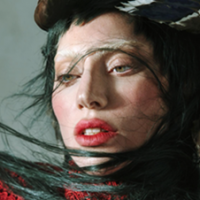
June 24, 201610 yr Author http://i.imgur.com/7I3gCd3.jpg 21. Hard Candy // 13 voters / 45 points First out is the one that we probably all expected to be last. Madonna's 11th studio album and her move into R&B, urban, hard hitting beats came with an equally as hard-hitting album. Madonna posed in front of the garishly bright pink background, rocking a heavyweight champion belt and... some leather ;o It's a very bold album, connoting images of bondage, dominatrix and power but ultimately it's pretty ghastly to look at and not one i'd want to show off on my CD shelf. It was initially going to be called 'Black Madonna' with album artwork to match, would that have done better or worse than this, lol? It got a shockingly poor average with only Regina and Harry showing it any sort of adoration. Lovers: Regina 11, Harry 9 Haters: Liamk, Tyler, Dandy* 0, Vibe 1
June 24, 201610 yr I unashamedly adore everytihng about HC, the artwork is so striking and I love having it on my ipod screen :lol:
June 24, 201610 yr Author I have come round to the album and enjoy a lot of it, and as much as it's a striking photo I don't think it works as an album cover. Maybe as a page in the album booklet, but I hate skimming through my albums and seeing her legs outstretched and in my face so garishly. She does look really good on it and I can see the appeal, but it's not for me. To turn to another of my faves though... it's probably better than the standard Born This Way album :ph34r:
June 25, 201610 yr I too enjoy the actual album - for its down points and un-Madonna sounding tracks, it's compensated for ones that show the opposite - but I just can't accept that artwork. It looks like someone has carelessly created a cover on photoshop with intention of taking the mick. Just awful and, for a long time, it had tainted my thoughts on the album content. To turn to another of my faves though... it's probably better than the standard Born This Way album :ph34r: I actually don't mind this cover. :ph34r:
June 26, 201610 yr Author The zoomed in Special Edition version is lovely and very striking but BikeGa is so tacky I find now. I've only ever really used the special edition cover so I rarely see the bike one but when I do its pretty monstrous lmao.
June 26, 201610 yr I think we can all agree that Born This Way: The Collection version is the absolute best though.
June 28, 201610 yr Author ^ yes :wub: Apologies for the delay btw, real life stuff! Will resume this asap ~
June 28, 201610 yr Author http://i.imgur.com/VSxijO7.jpg 20. Who's That Girl // 13 voters / 49 points Kick starting the top 20 is an album cover for the motion picture soundtrack for the film of the same name. Madonna performs on less than half of the tracks on the album but her striking pose on the artwork demands that it becomes her album. The most notable feature of the album is Madonna's dark, over-bearing eyebrows especially in contrast to the brightness of the rest of the image and it shows M in a playful, fun light, The album didn't get a single score above 8 ;o Lovers: Josh. 8, Vibe 7 Haters: Regina 0, Leww 1
June 28, 201610 yr Too flushed but a lot better than Hard Candy which is just awful in more than one way.
June 28, 201610 yr I agree about the eyebrows! :lol: It is a nice enough cover for a soundtrack and shows the gist of her character but, when you compare it to her studio album artwork that are so rich in detail and interpretation, even if they're simple, it's just not in the same league.
June 30, 201610 yr Author http://i.imgur.com/NXaZGFf.jpg 19. The Immaculate Collection // 13 voters / 62 points Next up we have the artwork for the first greatest hits compilation from Madge. A hugely successful collection but one that comes packaged quite... basically I find. It's one of only two in this rank not to actually feature Madonna's face which probably explains why it isn't as well appreciated here. It is quite an iconic cover, probably moreso due to the success of the album and limps out with a lowly score here. I don't think it's hated by people, more people are indifferent to it? No maximum or minimum score ;o Lovers: Joe. 8, SamJudd, Leww 7 Haters: River Lea 2, Regina, Haus, Tyler, Liamk 3